General
|
Property |
Description |
Property Type |
|---|---|---|
|
Name |
Name of the widget |
|
|
X |
X-axis position |
|
|
Y |
Y-axis position |
|
|
W |
Width |
|
|
H |
Height |
|
|
Color |
Main color of the widget |
|
|
Show Label |
Toggle for displaying label |
|
|
Label |
Text displayed as widget label |
|
|
Label Size |
Size of label text |
|
|
Label Color |
Color of label text |
|
|
Label Position |
Placement of the label |
|
2D Pad
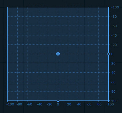
Sends an x and y Number (float or integer) between a min and a max value, allowing to adjust the snap and grid size.
You can use it to
-
control any 2 number values you want to have interactive control over
|
Property |
Description |
Property Type |
|---|---|---|
|
Relative |
Use relative positioning |
|
|
X |
X coordinate |
|
|
Min X |
Minimum X value |
|
|
Max X |
Maximum X value |
|
|
Decimal X |
X decimal places |
|
|
Step X |
X increment step |
|
|
Grid X |
X grid divisions |
|
|
Show Label X |
Show X label |
|
|
Y |
Y coordinate |
|
|
Min Y |
Minimum Y value |
|
|
Max Y |
Maximum Y value |
|
|
Decimal Y |
Y decimal places |
|
|
Step Y |
Y increment step |
|
|
Grid Y |
Y grid divisions |
|
|
Show Label Y |
Show Y label |
|
|
User Action |
Handler Event |
Trigger Event |
Default source |
|---|---|---|---|
|
Click or click and drag |
onChange |
CHANGE |
|
Button (Trigger)
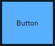
Sends predefined variables and/or event triggers when clicked. You can use it to
-
Trigger Blueprint events
-
Virtual camera moves
-
Actions/States
-
-
Trigger video keyer presets
-
Set
-
Actor transform
-
Actor parameters
-
|
Property |
Description |
Property Type |
|---|---|---|
|
Text |
Button text |
|
|
Text Color |
Color of button text |
|
|
Font Size |
Size of button text |
|
|
Toggle |
Whether button toggles. See Button (Toggle) |
|
|
User Action |
Handler Event |
Trigger Event |
Default source |
|---|---|---|---|
|
Click on button |
CLICK |
CLICK |
- |
Button (Toggle)
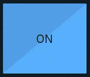
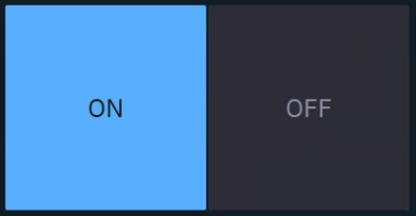
Sends predefined values and/or event triggers when clicked, while showing the current state.
You can use it
-
as a 2-state trigger
-
for on/off actions
-
Light switches
-
A to B transitions
-
Visibility toggles
-
Any boolean
-
|
Property |
Description |
Property Type |
|---|---|---|
|
Same as Button (Trigger), but with Toggle enabled. |
||
|
Value |
Current toggle state |
|
|
On Label |
Text when toggled on |
|
|
Off Label |
Text when toggled off |
|
|
On Value |
Value when toggled on |
|
|
Off Value |
Value when toggled off |
|
|
Off Text Color |
Color when off |
|
|
Off Color |
Background when off |
|
|
User Action |
Handler Event |
Trigger Event |
Default source |
|---|---|---|---|
|
Click on button |
CLICK |
CLICK |
|
|
Click on ON |
ON |
ON |
|
|
Click on OFF |
OFF |
OFF |
|
Color picker
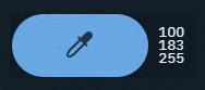
Opens a color picker and while making changes it sends updates
-
if confirmed, the color is kept
-
if cancelled, the original color is sent again
You can use it to
-
control light colors
|
Property |
Description |
Property Type |
|---|---|---|
|
Color |
Selected color |
|
|
Details |
Color format display |
|
|
User Action |
Handler Event |
Trigger Event |
Default source |
|---|---|---|---|
|
Change color
|
CHANGE |
CHANGE |
|
Dropdown
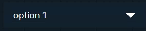
Switches between predefined values and/or event triggers when clicked, while showing the active option.
Use it the same way as the Tab widget.
|
Property |
Description |
Property Type |
|---|---|---|
|
Selected |
Currently selected option |
|
|
Options |
Available options |
|
|
Populate |
Populate options using predefined queries |
Action |
|
Cache Value |
Whether to cache selected value |
|
|
Text Color |
Text color |
|
|
Font Size |
Text size |
|
|
User Action |
Handler Event |
Trigger Event |
Default source |
|---|---|---|---|
|
Click on an option in the dropdown |
CHANGE |
CHANGE |
|
Frame
Embed another website into the control panel.
You can use it to
-
load other control panels
-
load help center articles
-
load external graphics
|
Property |
Description |
Property Type |
|---|---|---|
|
URL |
Web page to display |
|
|
Display |
Visibility setting |
|
|
Active |
Whether it is an active listener |
|
|
User Action |
Handler Event |
Trigger Event |
Default source |
|---|---|---|---|
|
- |
LISTENER |
LISTENER |
- |
Group
Visually group widgets together.
You can use it
-
to organize your control panel
-
as a modal dialog
-
Click the header to move all widgets within the group
-
Double click the header to select all widgets and scale the group
|
Property |
Description |
Property Type |
|---|---|---|
|
Modal |
Shows the group as modal dialog |
|
|
Trigger |
Description |
|
ShowModal |
Opens the modal dialog |
|
CloseModal |
Closes the modal dialog |
Image
-
Passive: image source can be controlled by an action on another widget
-
Active: can actively listen to changes
-
Double click the image to bring up the resources library
-
Upload or choose an existing image
-
Resources are stored in [Project folder]/ControlPanel/[Control panel folder]
Learn more about how to send images to the engine
You can use it to
-
display images
-
from url
-
from local file system
-
-
send image URLs to the URLImageActor
-
organize your control panel
|
Property |
Description |
Property Type |
|---|---|---|
|
URL/Src |
Image source |
|
|
Display |
Visibility setting |
|
|
Stretch |
How image fits frame |
|
|
Active |
Whether it is an active listener |
|
|
User Action |
Handler Event |
Trigger Event |
Default source |
|---|---|---|---|
|
- |
LISTENER |
LISTENER |
|
Label
Shows a text or JSON view.
-
Passive: can be controlled by an action on another widget
-
Active: can actively listen to changes
You can use it to
-
have an independent label text with optional background color
-
display values as text or JSON
-
organize your control panel
-
select and copy values
|
Property |
Description |
Property Type |
|---|---|---|
|
Text |
Label text |
|
|
Render |
Rendering method |
|
|
Background |
Background color |
|
|
Selectable |
Whether text is selectable |
|
|
Active |
Whether label is active |
|
|
User Action |
Handler Event |
Trigger Event |
Default source |
|---|---|---|---|
|
- |
LISTENER |
LISTENER |
|
Listener

Listens to changes of the Source property.
You can use it to
-
listen to the change of any property
|
User Action |
Handler Event |
Trigger Event |
Default source |
|---|---|---|---|
|
- |
LISTENER |
LISTENER |
- |
Number
Sends a Number (float or integer)
You can use it to
-
update numeric values
-
Scoreboards
-
Statistics
-
Data
-
-
trigger Blueprint events that take a numeric parameter
|
Property |
Description |
Property Type |
|---|---|---|
|
Min |
Minimum value |
|
|
Max |
Maximum value |
|
|
Value |
Current value |
|
|
Unit |
Unit of measurement |
|
|
Precision |
Decimal places |
|
|
Font Size |
Text size |
|
|
Trigger |
Description |
|
Focus |
Focuses the input field |
|
User Action |
Handler Event |
Trigger Event |
Default source |
|---|---|---|---|
|
CHANGE |
CHANGE |
|
Playlist
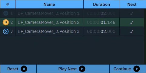
Executes actions in a sequence triggered manually or based on time.
You can use it to
-
control actions in a sequence
|
Property |
Description |
Property Type |
|---|---|---|
|
Play on startup |
Auto-play setting |
|
|
Controls |
Show playback controls |
|
|
Getter |
Description |
|
CurrentActionIndex |
Get current action index |
|
CurrentActionName |
Get name of current action |
|
CurrentActionDuration |
Get duration of current action |
|
CurrentActionProgress |
Get progress of current action |
|
CurrentActionTime |
Get time of current action |
|
NextIndex |
Get next action index |
|
NextName |
Get name of next action |
|
OverallTimeElapsed |
Get total elapsed time |
|
GetCount |
Get total number of actions |
|
Trigger |
Description |
|
NextAction |
Trigger next action |
|
StopAction |
Stop playlist and reset playhead |
|
StartFrom |
Go to |
|
Pause |
Go to |
|
Resume |
Resume playlist |
|
Delay |
Delay next action |
|
Pause |
Pause playlist |
Slider
Sends a Number (float or integer) between a min and a max value.
You can use it to
-
control virtual lights
-
control physical lights
-
via DMX
-
-
control X/Y/Z dimensions of transforms
-
control color channels
-
control any states you want to fade between
-
control any number value you want to have interactive control over
|
Property |
Description |
Property Type |
|---|---|---|
|
Min |
Minimum value |
|
|
Max |
Maximum value |
|
|
Value |
Current value |
|
|
Step |
Step increment |
|
|
Decimal |
Decimal places |
|
|
Middle |
Show middle marker |
|
|
Orientation |
Slider direction |
|
|
User Action |
Handler Event |
Trigger Event |
Default source |
|---|---|---|---|
|
Click or click and drag |
onChange |
CHANGE |
|
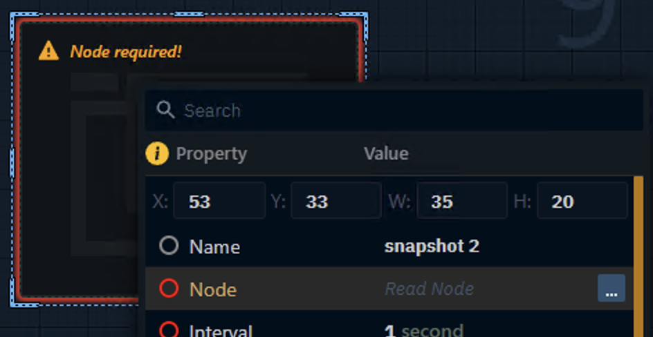
Snapshot
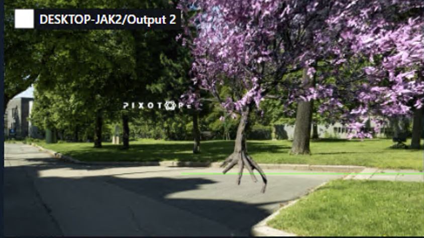
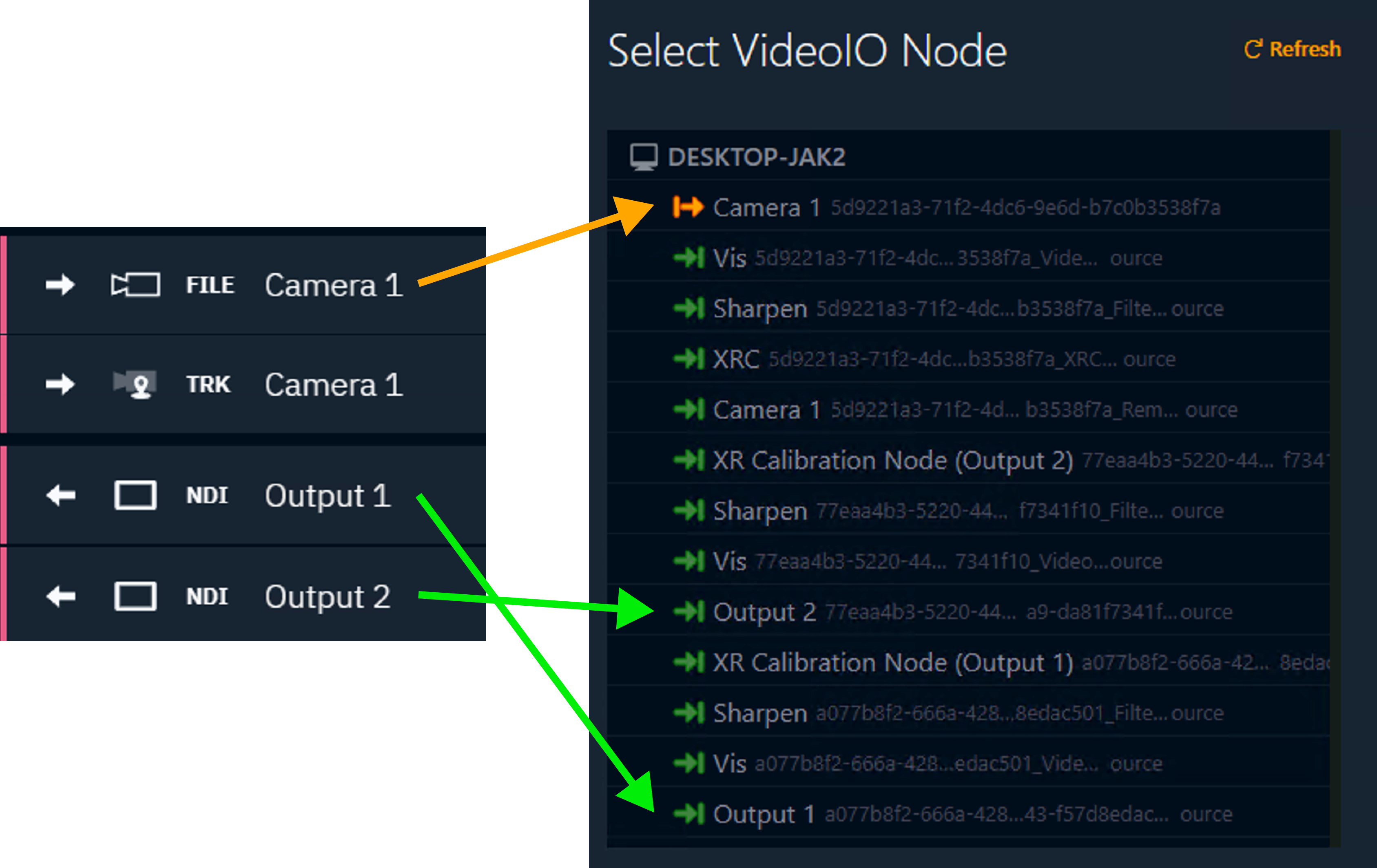
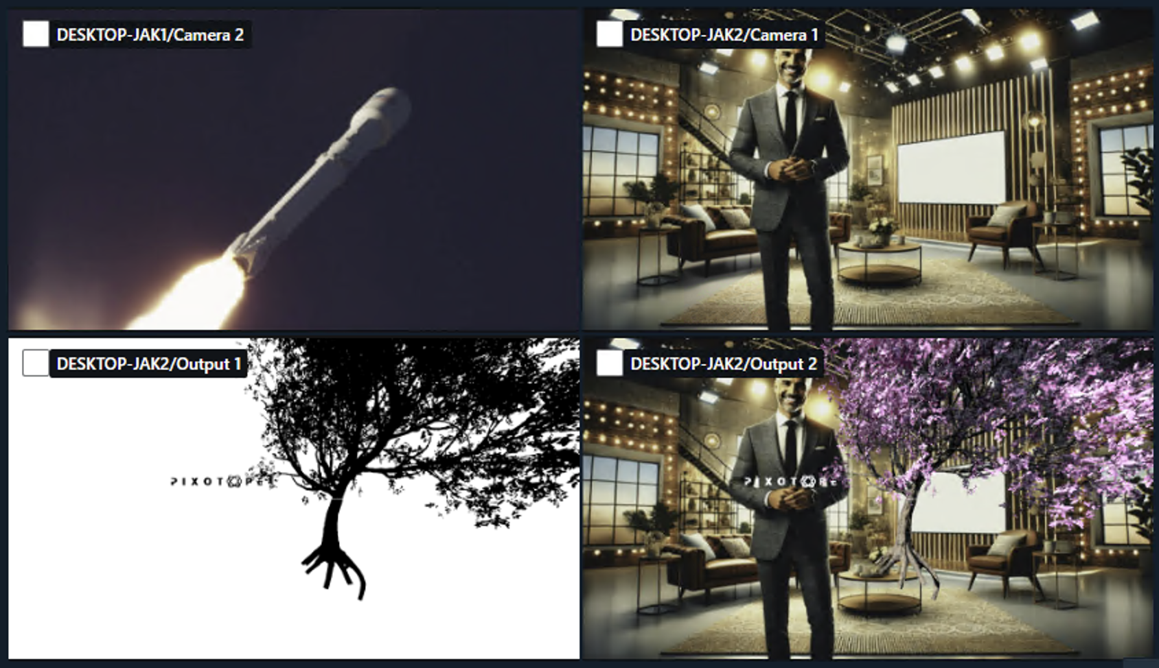
Captures an image from a selected node inside the videoIO service of a machine. Set the
-
scale and update interval
You can use it to
-
build a multi-viewer
|
Property |
Description |
Property Type |
|---|---|---|
|
Node |
Select which videoIO node the image should be captured from |
|
|
Interval |
Capture frequency |
|
|
Scale |
Image scale |
|
|
Requests Sent |
Count of sent requests |
|
|
Frames Received |
Count of received frames |
|
|
Process Time |
Time to generate the frame |
|
|
Image |
Output |
|
|
Display |
Visibility setting |
|
|
Stretch |
How image fits frame |
|
|
User Action |
Handler Event |
Trigger Event |
Default source |
|---|---|---|---|
|
- |
RECEIVED |
RECEIVED |
- |
Tabs
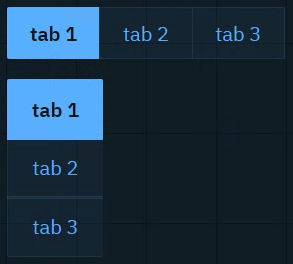
Sends predefined values and/or event triggers when clicked, while showing the current state. The list of options can be manually set up or imported from a List property of an engine object.
Learn more about how to Populate Options for Tab and Dropdown widget
You can use it to
-
switch between predefined values (
Number,String)-
Infographics
-
Name fields
-
Title bars
-
|
Property |
Description |
Property Type |
|---|---|---|
|
Cache Value |
Whether to cache selected value |
|
|
Selected |
Currently selected tab |
|
|
Options |
Available options |
|
|
Populate |
Populate options using predefined queries |
Action |
|
Scroll |
Allow scrolling |
|
|
Font Size |
Text size |
|
|
Orientation |
Tab orientation |
|
|
User Action |
Handler Event |
Trigger Event |
Default source |
|---|---|---|---|
|
Click on tab |
CLICK |
CLICK |
|
|
Click on Tab 1 |
TAB 1 CLICK |
TAB 1 CLICK |
|
|
Click on Tab 2 |
TAB 2 CLICK |
TAB 2 CLICK |
|
|
… |
|
|
|
Text
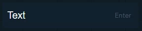
Sends a String. The text can be typed or pasted in.
You can use it to
-
update text and number values
-
News tickers
-
Infographics
-
Name fields
-
Title bars
-
Scoreboards
-
-
trigger Blueprint events that take a text OR numeric parameter
|
Property |
Description |
Property Type |
|---|---|---|
|
Text |
Input text |
|
|
Trigger |
Description |
|
Enter |
Submits/Sends the string |
|
Focus |
Focuses the input field |
|
User Action |
Handler Event |
Trigger Event |
Default source |
|---|---|---|---|
|
Press |
CHANGE |
CHANGE |
|
Text (multiline)
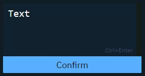
Sends a String (including line breaks).
Text can be typed or pasted.
Use it the same way as the Text widget.
|
Property |
Description |
Property Type |
|---|---|---|
|
Text |
Content of text area |
|
|
Confirm |
Text of confirmation button |
|
|
Button Color |
Button background color |
|
|
Trigger |
Description |
|
Focus |
Focuses the input field |
|
User Action |
Handler Event |
Trigger Event |
Default source |
|---|---|---|---|
|
Press |
CHANGE |
CHANGE |
|
Timer
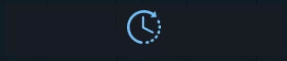
Triggers the actions with a constant interval.
You can use it to
-
set up triggers with a constant interval
|
Property |
Description |
Property Type |
|---|---|---|
|
Interval |
Time between triggers |
|
|
Auto Start |
Start interval when going live |
|
|
Enabled |
Whether timer is active |
|
|
Trigger |
Description |
|
Start |
Starts the timer |
|
Stop |
Stops the timer |
|
User Action |
Handler Event |
Trigger Event |
Default source |
|---|---|---|---|
|
- |
INTERVAL |
INTERVAL |
- |
Vector input (1D, 2D, 3D, 4D)
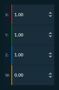
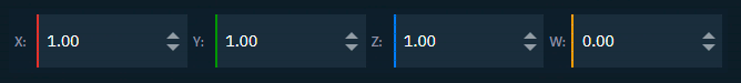
Sends a Vector (1D, 2D, 3D, 4D)
You can use it to
-
update vector values
-
Location
-
Rotation
-
Scale
-
Color
-
|
Property |
Description |
Property Type |
|---|---|---|
|
Axis Labels |
Show axis labels |
|
|
Min |
Minimum value |
|
|
Max |
Maximum value |
|
|
Value |
Vector value |
|
|
Use X |
Toggle X axis |
|
|
Label X |
X axis label |
|
|
Value X |
X axis value |
|
|
Use Y |
Toggle Y axis |
|
|
Label Y |
Y axis label |
|
|
Value Y |
Y axis value |
|
|
Use Z |
Toggle Z axis |
|
|
Label Z |
Z axis label |
|
|
Value Z |
Z axis value |
|
|
Use W |
Toggle W axis |
|
|
Label W |
W axis label |
|
|
Value W |
W axis value |
|
|
Precision |
Decimal places |
|
|
Font Size |
Text size |
|
|
User Action |
Handler Event |
Trigger Event |
Default source |
|---|---|---|---|
|
CHANGE |
CHANGE |
|
System actions
Learn more about System actions