
Control panel - Widget and property types
Widget types
Type | Image | Behavior | Action event | Default source | Purpose |
|---|---|---|---|---|---|
Button (Trigger) | 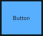 | Sends predefined variables and/or event triggers when clicked |
| - |
|
Button (Toggle) (Same as button, with "Toggle" enabled)  | 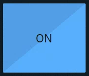 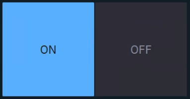 ON and OFF state | Sends predefined values and/or event triggers when clicked Shows current state |
|
|
|
Tabs | 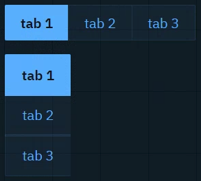 | Sends predefined values and/or event triggers when clicked Shows current state List of options can be manually set up or imported from a |
|
|
|
Drop-down |  | Switches between predefined values and/or event triggers when clicked Shows active option List of options can be manually set up or imported from a |
|
|
|
Slider | 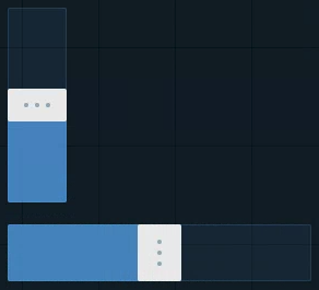 | Sends a |
|
|
|
Number | 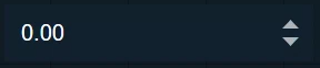 | Sends a
|
|
|
|
Text | 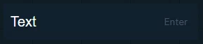 | Sends a Text can be typed or pasted in |
|
|
|
Text (multiline) | 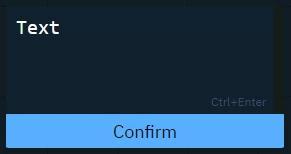 | Sends a
Text can be typed or pasted |
|
|
|
Color picker |  | Opens a color picker and sends a color value when confirmed |
|
|
|
Timer |  | Triggers the action with a constant interval |
| - |
|
Listener |  | Listens to changes of the Source property |
| - |
|
Label |  | Passive, but text can be controlled | No action |
|
|
Image |  | Passive, but image source can be controlled Double click the image to bring up the resources library. Upload or choose an existing image. | No action |
|
|
Group |  | Passive Click the header to move all widgets within the group Double click the header to select all widgets including the group | No action | - |
|
Supported target property types
Property type | Source | Related UE4 type names |
|---|---|---|
|
| bool |
| any float or integer number | byte, integer, integer64, float |
| any text string | FName, FString, FText |
| any | Enums (any type starting with U and ending with *) |
|
| FColor |
|
| Transform |
|
| FVector |
| Custom properties with their respective property types Every argument can be controlled separately | |
| - |