Creating a control panel - PRODUCTION
The Pixotope Director allows you to create custom remote-control panels, which run:
in a web browser on your Pixotope network
You can control:
all properties that can be exposed from within the Pixotope Editor
all functions on Blueprint actors
Learn more about the supported widget and property types
Want to give feedback?
This is another step on the journey where we would welcome your input and thoughts. If you are interested in giving feedback, sharing your use cases or contributing in general, we would love to invite you to our Control Panel slack channel! Just send an email to design@pixotope.com
Academy Tutorial - User configurable control panel
Introduction to our new control panel
Create a control panel
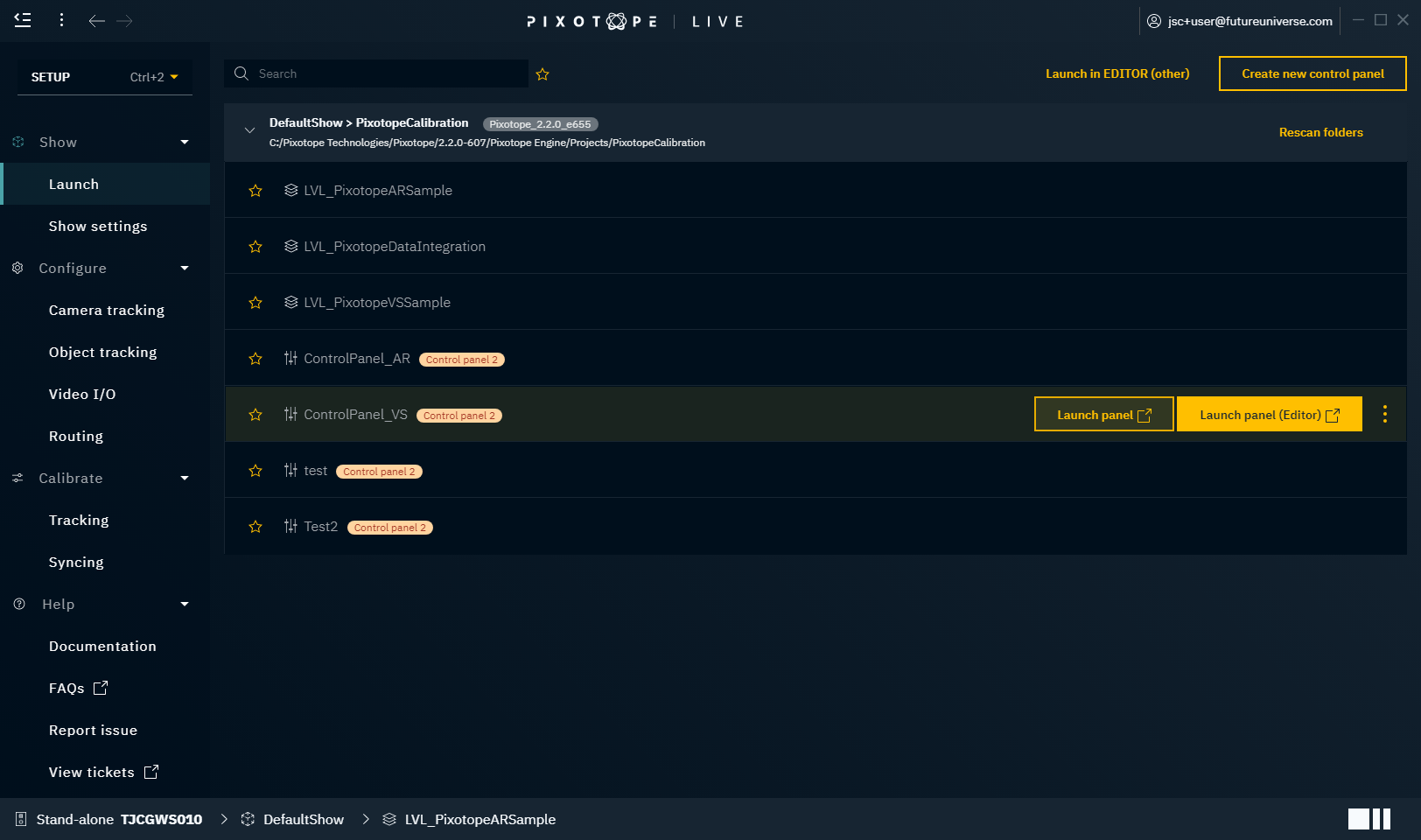
Go to PRODUCTION > Show > Launch
Click "Create new control panel"
Give it a descriptive name
The control panel is opened in your default browser
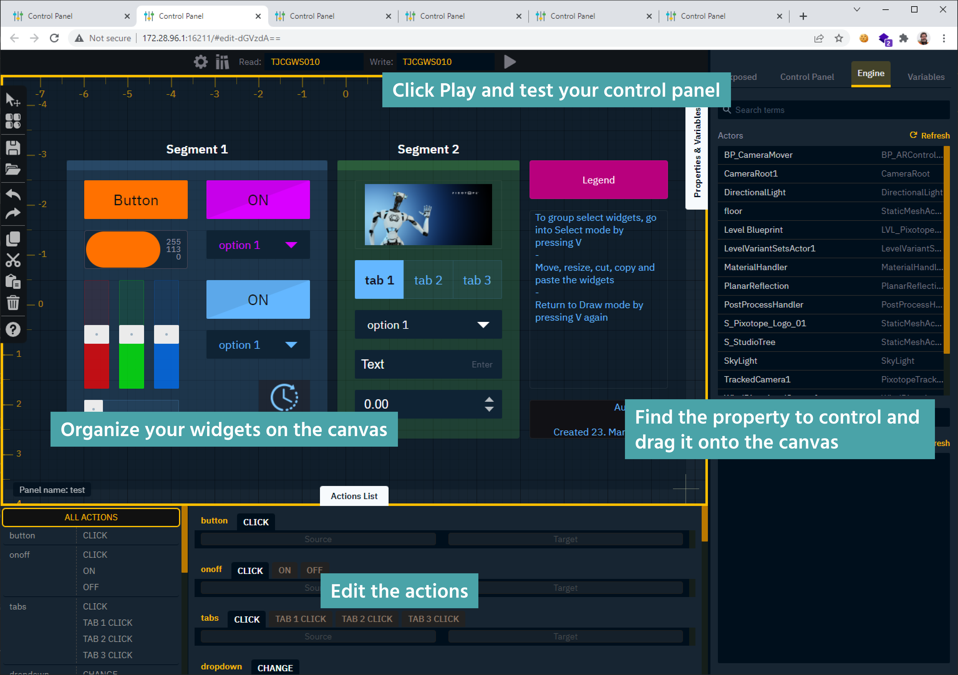
Learn more about the Control Panel - Interface and its Keyboard shortcuts
Learn more about where control panels are stored
Open a control panel
Go to PRODUCTION > Show > Launch
Hover over the control panel you want to open and click "Launch panel (Editor)"
The control panel is opened in your default browser
Find the property to control
Any property with a red/orange circle to the left of the property can be controlled.
For functions use FN
Learn more about Supported target property types
Go to the "Properties and Variables" drawer to find the Target property you want to control
Exposed tab - shows all exposed properties
Control panel tab - shows all widgets and their properties
Engine tab - shows all objects/actors in a level and all their properties
Variables tab - shows all global variables
If necessary use the search field to search for objects/actors or properties (use the exposed filter )
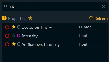
Sub properties
Some properties can be further broken down into sub properties which can be controlled.
Click on the down arrow next to the property name
Transform

Color

Expose property to show up in Exposed tab
Properties can be exposed in two ways
Per object/widget
Exposes the property of one specific object
Per class (only for objects/actors)
Exposes the property for all objects based on this class
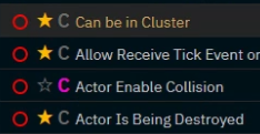
Go to any property with a star and/or C icon
Click the
Star icon to expose the property per object
C icon to expose the property per class
Functions, transforms and visibility can currently not be exposed
World settings are only exposable per class
Of course you can always Expose properties from within the Editor
Add widgets with actions
You can create widgets with actions
in one go
OR separately (see Add widgets and actions separately)
In the "Properties and Variables" drawer find the Target property you want to control
Click and drag the red circle of a Target property onto the canvas
(for functions dragFN)Holding down
Ctrlwhile dragging will insert the last selected widget, skipping the toolbox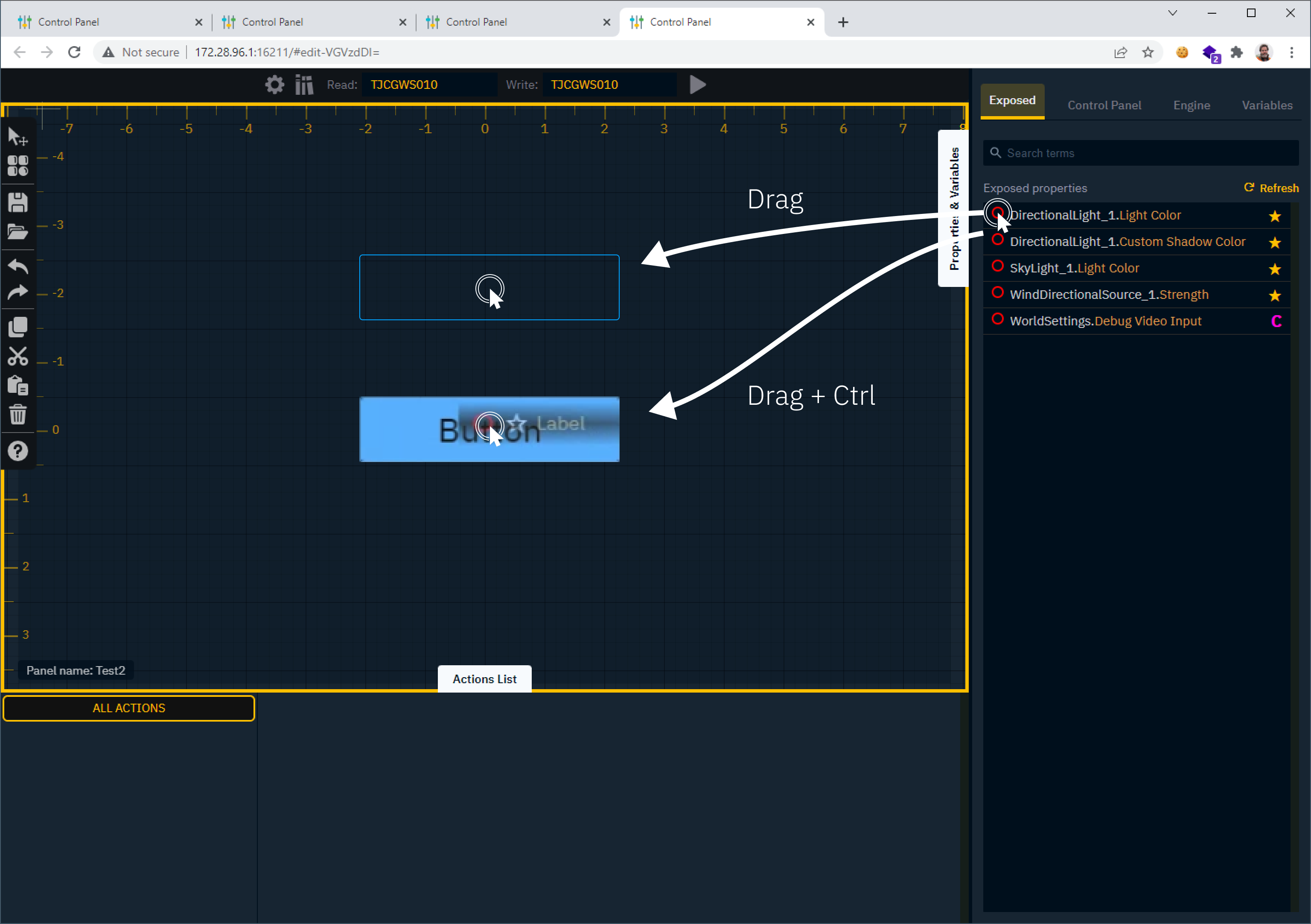
The widget toolbox is opened
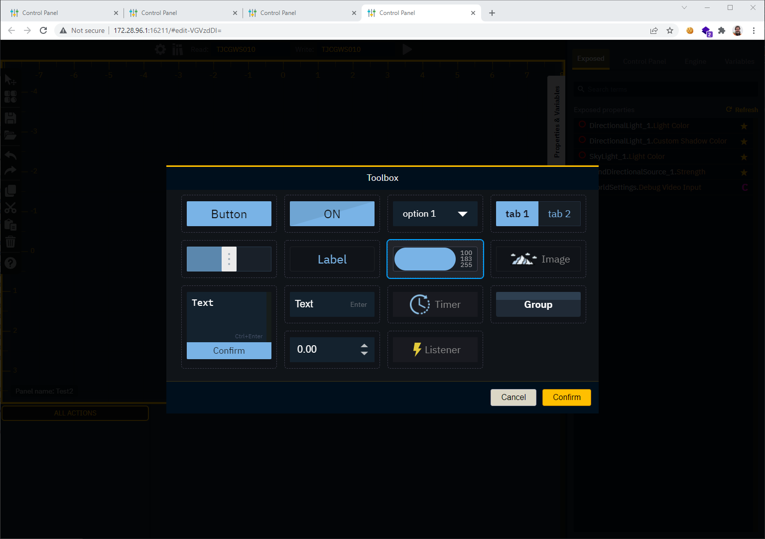
Double click the widget which should control this property
OR select it and click "Confirm"The widget is added to the canvas
An action is added to the widget
Setting the default value of the widget as the Source
Setting the dragged property as the Target
An action is attached to a specific widget which triggers it
When triggered, it sends the Source value or property to the Target property
Actions can use properties from running levels, as well as from other widgets on the canvas
Edit widgets
Right click one or more widgets
OR select them on the canvas or the "Control panel" tab in the "Properties and Variables" drawer
Change any of the properties in the properties section by clicking into its value field
Editing properties of multiple widgets at once can only be done if they are of the same type
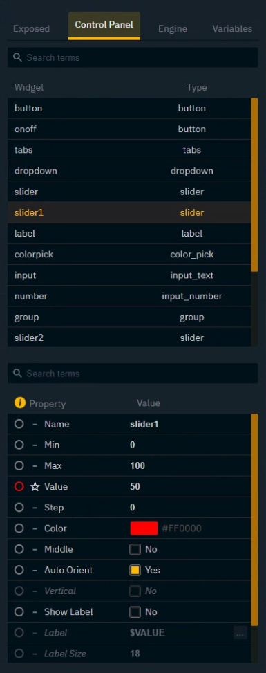
Populate Options for Tab and Select widget
Select the Tab or Select widget, add values and labels respectively

Double click
Listof a Enum or Array property in the "Engine" tab of the "Properties and Variables" drawer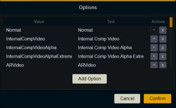
Organize widgets
To organize your widgets you have many options
Arrange widgets
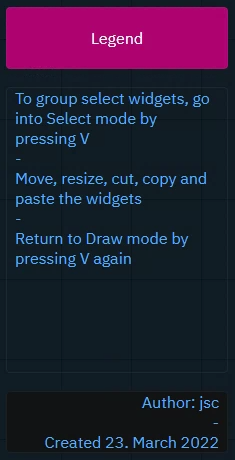
To group select widgets, go into Select mode by pressing
VMove, resize, cut, copy and paste the widgets
Return to Draw mode by pressing
Vagain
Edit actions
For the widget to read the target property when switching to Live mode, click on the arrow between source and target and set the direction of the action to "Bidirectional"
not available for Button (Trigger)

Optional: for the Source
Override the default Source property by dragging another property onto the source drop zone
OR set a constant value by double clicking into the source drop zone

Learn more about Supported target objects and properties
Additional options
To automatically trigger an action when switching to Live mode, enable the "STARTUP" toggle
To remove a value or property, click the x to the right of the Source or Target field
To remove the action, click the x all the way to the right of the action row

Custom options based on widget and property type
Some widgets and property types offer additional options.
Button (Toggle) and Tab widget
These widgets have more than one action event which actions can be added to.
Learn more about supported action events

Transform type
Transforms can be dragged into the action list
as a whole
When dragged in as a whole, the transform type breaks down into its individual sub property fields.
Drag any source property into the individual fields
OR set a constant value by double clicking into the field
At the trigger time, the individual values will be combined and set as the new transform

Function type

If function have arguments, the arguments are listed.
Drag any source property into the individual fields
OR set a constant value by double clicking into the field
Add widgets and actions separately
Add a widget
Press
Tto open the toolboxDouble click the widget
OR select it and click "Confirm"Click and drag on the canvas to place/draw the widget
If necessary Press
Vto switch between Draw and Select mode
Add an action to a widget
You can drag an action either
directly onto a widget
OR onto the actions list
This will automatically set the default value of the widget as the source
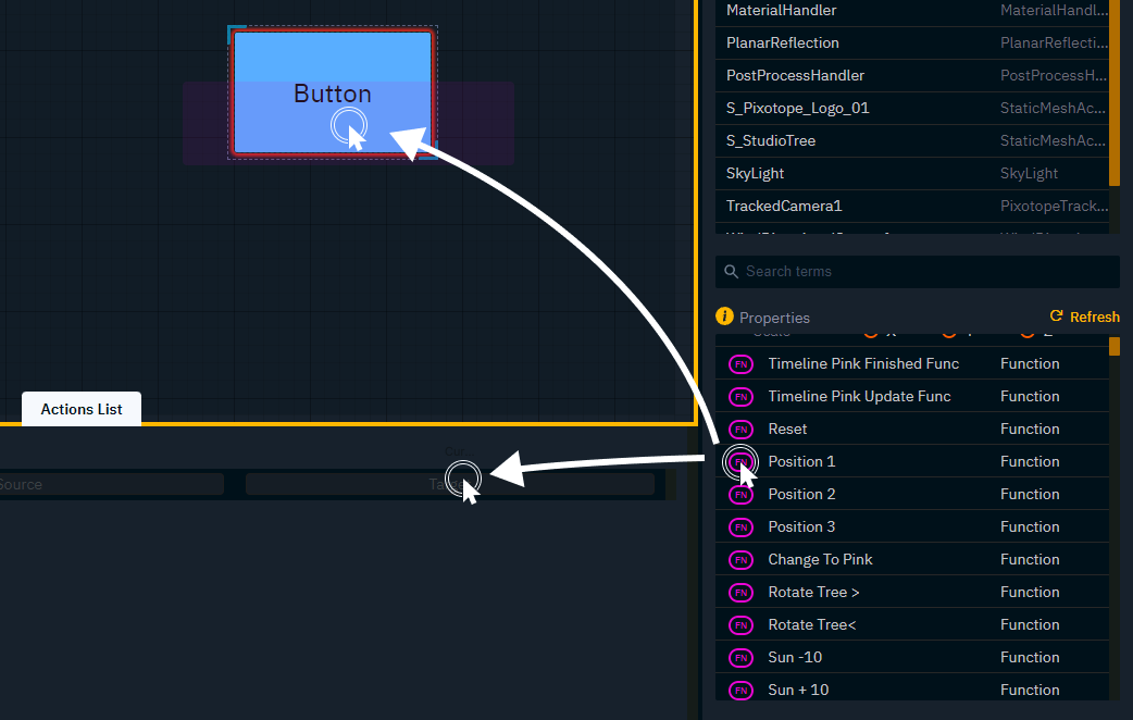
Drag action onto widget
In the "Properties and Variables" drawer find the Target property you want to control
Click and drag the red circle of a Target property onto a widget
Drag action onto actions list
Double click the widget on the canvas to focus its action list
Click and drag the red circle of the Target property onto the target drop zone
For functions drag FN instead of the red circle
Go live
Save a control panel
Click on the save icon in the shortcuts bar on the left
OR pressCtrl+S
To avoid losing data
we warn you before you close or reload the tab
we try to recover the last unsaved version in case Director, which serves the page, crashes
Preview Live mode
Press
Ror the "Play" button in the headerThe yellow border is removed
The canvas is centered
You cannot add or move widgets
This mode allows you to continue editing the widgets properties and actions.
Click on the Settings icon in the header to open the Control panel editor settings
Enable "Show Drawers on Run mode"
Click "Apply"
Exit Preview Live mode
Press
Ror the "Stop" button in the header
Live mode
This mode removes any ability to edit the control panel including switching between Edit and Preview Live mode
Click on "Launch panel" from the Launch panel in Director
