Link a property to a widget
You can link properties to widgets
-
in one go
-
OR separately (see Link properties separately)
-
In the "Properties" drawer find the Target property you want to control
-
Click and drag the red circle ⭕ of a Target property onto the canvas
(for functions dragFN)-
Holding down
Ctrlwhile dragging will insert the last selected widget, skipping the toolbox selection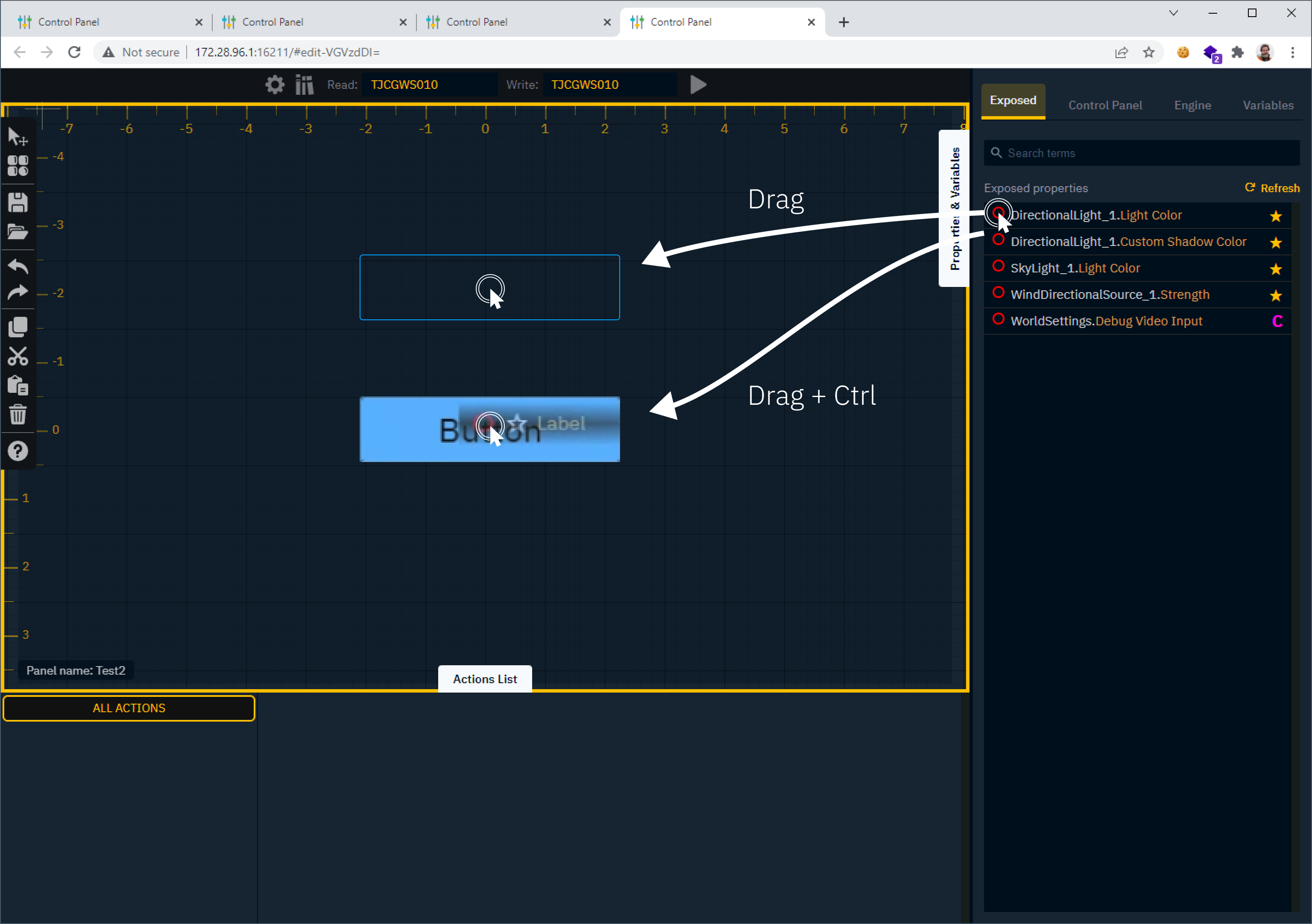
-
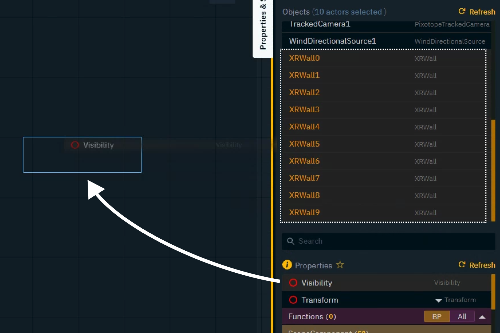
To link the same property of multiple objects
-
Select multiple objects in the Engine tab
-
Drag one of their properties to the canvas (same as above)
-
-
-
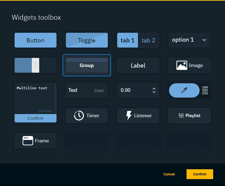
The widget toolbox is opened
-
Double click the widget which should control this property
OR select it and click "Confirm"-
The widget is added to the canvas
-
An action is added to the widget
-
Setting the default value of the widget as the Source
-
Setting the dragged property as the Target
-
-
-
An action is attached to a specific widget which triggers it
-
When triggered, it sends the Source value or property to the Target property
-
Actions can use properties from running levels, as well as from other widgets on the canvas
Link properties separately
Add a widget
-
Press
Tto open the toolbox -
Double click the widget
OR select it and click "Confirm" -
Click and drag on the canvas to place/draw the widget
-
If necessary Press
Vto switch between Draw and Select mode
-
Link a property to a widget
-
Select one or more objects
-
Drag a property either
-
directly onto a widget
-
OR onto the Action in the Actions drawer
-
This will automatically set the default value of the widget as the source
Drag property onto widget
-
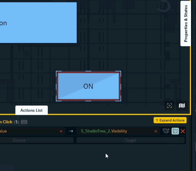
In the "Properties" drawer find the Target property you want to control
-
Click and drag the red circle ⭕ of a Target property onto a widget
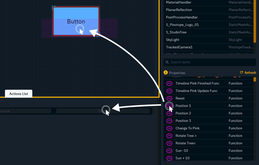
Drag property into the Actions drawer
-
Double click the widget on the canvas to focus its action list
-
Click and drag the red circle ⭕ of the Target property onto the target drop zone
For functions drag FN instead of the red circle
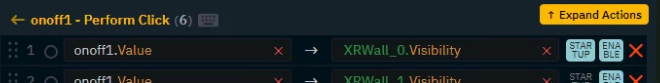
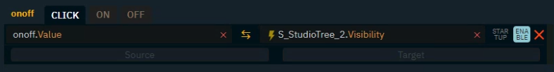
Edit actions
Change action behaviour
|
Unidirectional (default) |
|
The value is sent from the source to the target |
|---|---|---|
|
Bidirectional |
|
The value is read from the target to source |
|
Startup |
|
The value is sent from the source to the target |
Bidirectional
-
Click on the arrow between source and target and set the direction of the action to "Bidirectional"
not available for: Button (Trigger), Function and API calls
Startup
-
Click on STARTUP on the right side of the action
Change source
-
Change the default Source property by dragging another property onto the source drop zone
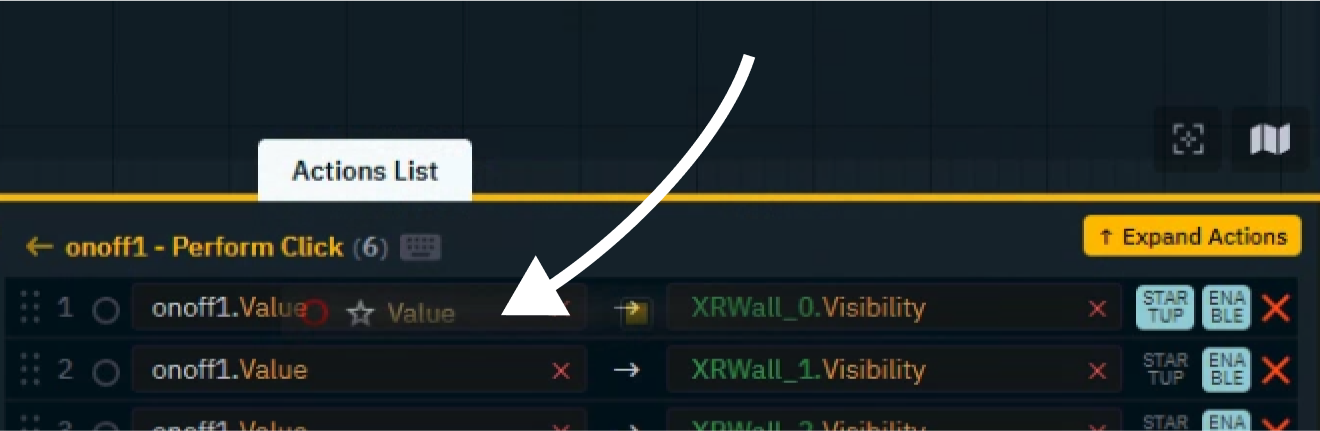
-
OR set a constant value by double clicking into the source drop zone
Learn more about Supported target property types
Change object
To only change the source or target object while keeping the property
-
Click the green object name of an action
-
Select another object and click "Update"
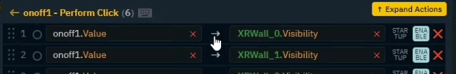
Remove a value or a property
To remove a value or property, click the x to the right of the Source or Target field.
Remove an action
To remove an action, click the x all the way to the right of the action row.
Copy an action
-
Drag the action onto another widget using the red circle ⭕
Custom options based on widget and property type
Some widgets and property types offer additional options.
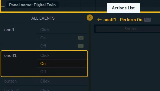
Button (Toggle) and Tab widget
These widgets have more than one action event which actions can be added to.
Learn more about supported events and actions
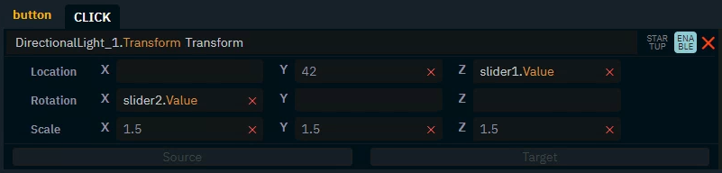
Transform type
Transforms can be dragged into the action list
-
as sub properties
-
as a whole
When dragged in as a whole, the transform type breaks down into its individual sub property fields.
-
Drag any source property into the individual fields
-
OR set a constant value by double clicking into the field
At the trigger time, the individual values will be combined and set as the new transform
Function type
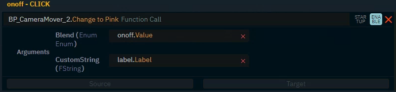
If function have arguments, the arguments are listed.
-
Drag any source property into the individual fields
-
OR set a constant value by double clicking into the field
API Call type
Learn more about Advanced usage of the control panel
Add additional triggers - via keyboard or another widget
Widgets are typically triggered by a mouse or touch action. In addition a widget can also be triggered by
-
a hotkey (keyboard shortcut)
-
another widget
Learn more about supported events and actions
Trigger using a hotkey
-
Select the widget and event which should be triggered by the shortcut
-
Click on the "Keyboard icon" to open the hotkey
-
Click in the input field and press the keyboard shortcut
-
Click "Confirm"
When using a keyboard shortcut used by the browser the original behaviour will be ignored.
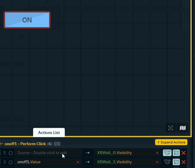
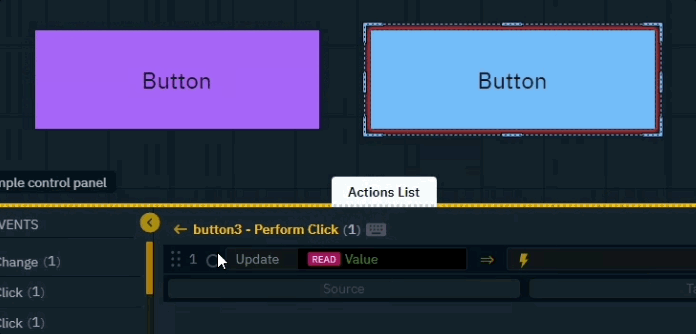
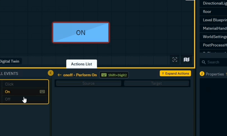
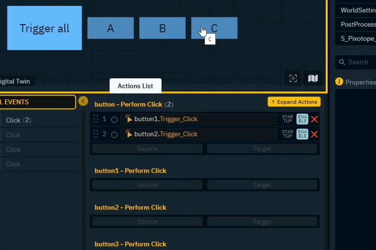
Trigger using another widget
Meta actions allow widgets to trigger/control other widgets.
-
Right click the widget you want to control and scroll down
-
Drag the "Perform Click" action onto the controlling widget
Next step
Continue to Edit and organize widgets