Button (Trigger)
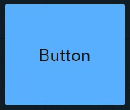
Sends predefined variables and/or event triggers when clicked. You can use it to
-
Trigger Blueprint events
-
Virtual camera moves
-
Actions/States
-
-
Trigger video keyer presets
-
Set
-
Actor transform
-
Actor parameters
-
|
Events |
Actions |
Default source |
|---|---|---|
|
|
- |
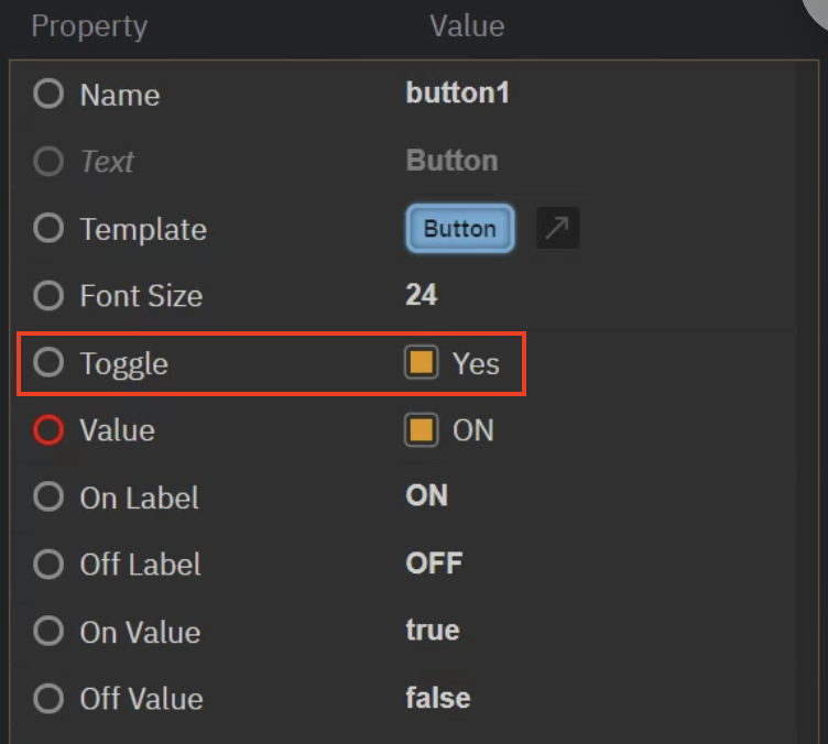
Button (Toggle)
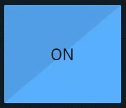
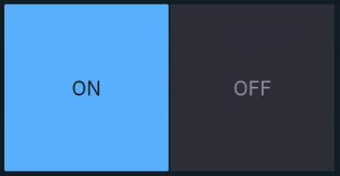
Sends predefined values and/or event triggers when clicked, while showing the current state.
You can use it
-
as a 2-state trigger
-
for on/off actions
-
Light switches
-
A to B transitions
-
Visibility toggles
-
Any boolean
-
Same as button, but with Toggle enabled.
|
Events |
Actions |
Default source |
|---|---|---|
|
|
|
Tabs
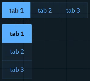
Sends predefined values and/or event triggers when clicked, while showing the current state. The list of options can be manually set up or imported from a List property of an engine object.
Learn more about how to Populate Options for Tab and Select widget
You can use it to
-
switch between predefined values (
Number,String)-
Infographics
-
Name fields
-
Title bars
-
|
Events |
Actions |
Default source |
|---|---|---|
|
|
|
Dropdown
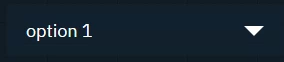
Switches between predefined values and/or event triggers when clicked, while showing the active option.
Use it the same way as the Tab widget.
|
Events |
Actions |
Default source |
|---|---|---|
|
|
|
Slider
Sends a Number (float or integer) between a min and a max value.
You can use it to
-
control virtual lights
-
control physical lights
-
via DMX
-
-
control X/Y/Z dimensions of transforms
-
control color channels
-
control any states you want to fade between
-
control any number value you want to have interactive control over
|
Events |
Actions |
Default source |
|---|---|---|
|
|
|
2D Pad
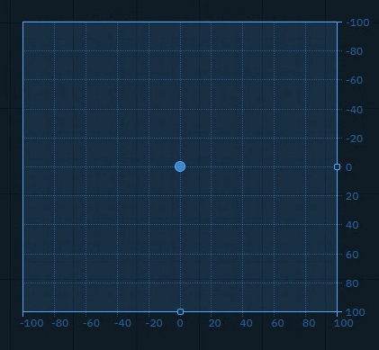
Sends an x and y Number (float or integer) between a min and a max value, allowing to adjust the snap and grid size.
You can use it to
-
control any 2 number values you want to have interactive control over
|
Events |
Actions |
Default source |
|---|---|---|
|
|
|
Number
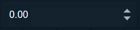
Sends a Number (float or integer) when field is changed, either by
-
number entry closing with
Enter -
clicking the arrows
-
scrolling
You can use it to
-
update numeric values
-
Scoreboards
-
Statistics
-
Data
-
-
trigger Blueprint events that take a numeric parameter
|
Events |
Actions |
Default source |
|---|---|---|
|
|
|
Text
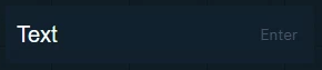
Sends a String when the Enter key is pressed. The text can be typed or pasted in.
You can use it to
-
update text and number values
-
News tickers
-
Infographics
-
Name fields
-
Title bars
-
Scoreboards
-
-
trigger Blueprint events that take a text OR numeric parameter
|
Events |
Actions |
Default source |
|---|---|---|
|
|
|
Text (multiline)
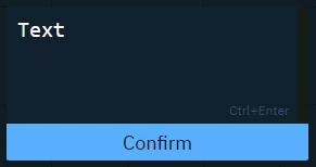
Sends a String (including line breaks) when
-
"Confirm" button is clicked
-
Ctrl+Enteris pressed
Text can be typed or pasted.
Use it the same way as the Text widget.
|
Events |
Actions |
Default source |
|---|---|---|
|
|
|
Color picker
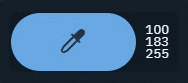
Opens a color picker and while making changes it sends updates
-
if confirmed, the color is kept
-
if cancelled, the original color is sent again
You can use it to
-
control light colors
|
Events |
Actions |
Default source |
|---|---|---|
|
|
|
Playlist
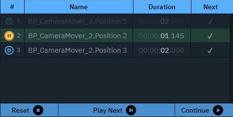
Executes actions in a sequence triggered manually or based on time.
You can use it to
-
control actions in a sequence
|
Events |
Actions |
Default source |
|---|---|---|
|
- |
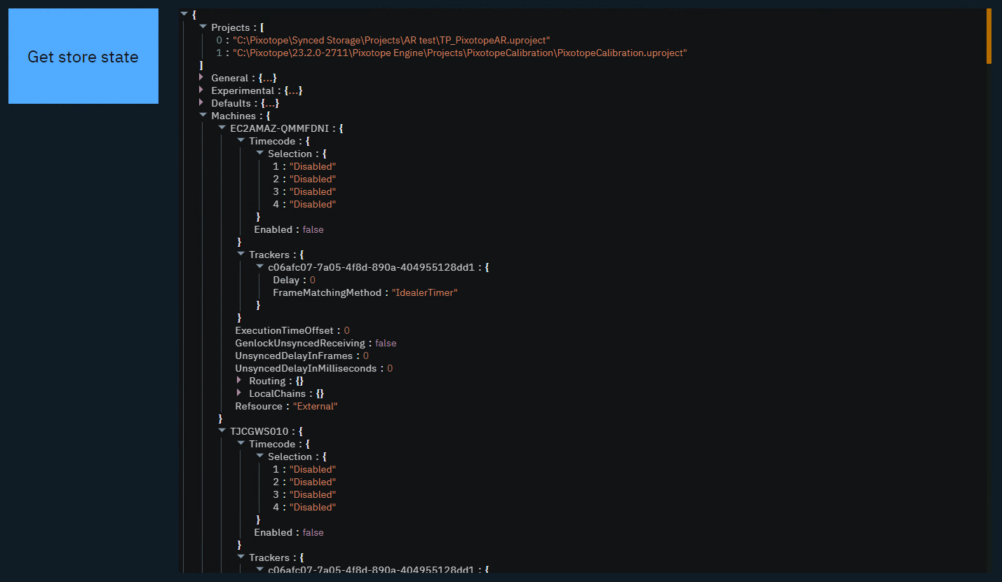
Get
|
- |
Timer
Triggers the actions with a constant interval.
You can use it to
-
set up triggers with a constant interval
|
Events |
Actions |
Default source |
|---|---|---|
|
|
- |
Listener

Listens to changes of the Source property.
You can use it to
-
listen to the change of any property
|
Events |
Actions |
Default source |
|---|---|---|
|
|
- |
Label
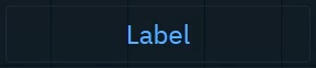
Shows a text or JSON view.
-
Passive: can be controlled by an action on another widget
-
Active: can actively listen to changes
You can use it to
-
have an independent label text with optional background color
-
display values as text or JSON
-
organize your control panel
-
select and copy values
|
Events |
Actions |
Default source |
|---|---|---|
|
|
|
Image
-
Passive: image source can be controlled by an action on another widget
-
Active: can actively listen to changes
-
Double click the image to bring up the resources library
-
Upload or choose an existing image
-
Resources are stored in [Project folder]/ControlPanel/[Control panel folder]
Learn more about how to send images to the engine
You can use it to
-
display images
-
from url
-
from local file system
-
-
send image URLs to the URLImageActor
-
organize your control panel
|
Events |
Actions |
Default source |
|---|---|---|
|
|
|
Frame
Embed another website into the control panel.
You can use it to
-
load other control panels
-
load help center articles
-
load external graphics
|
Events |
Actions |
Default source |
|---|---|---|
|
- |
|
- |
Group
Visually group widgets together.
You can use it
-
to organize your control panel
-
as a modal dialog
-
Click the header to move all widgets within the group
-
Double click the header to select all widgets and scale the group
|
Events |
Actions |
Default source |
|---|---|---|
|
- |
If modal
|
- |
System actions
Learn more about System actions