Learn more about Creating a control panel - PRODUCTION
Learn more about Control panel - Keyboard shortcuts
The Control Panel is a service with which you can create custom control panels to monitor and control any aspect of the Pixotope Graphics environment.
The Control Panel service layout can be customized using dockable panels.
The Control Panel service is served by a Pixotope service which launched/created it. In case Pixotope on this machine is shut down, the control panel will loose connection and wait for Pixotope to be started up again.
The Control Panel service runs in a browser. It has been developed for Google Chrome though other browsers might also work.
Menu
Access general actions and add panels.
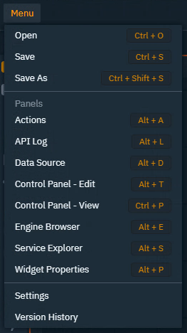
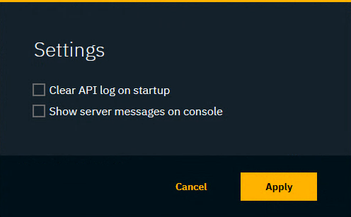
Settings
Make changes to the behaviour and look of the Control Panel Editor
-
Clear API log on startup
-
Show server messages on console
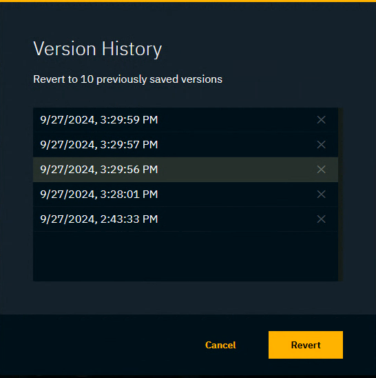
Version history
Go back to a previously saved version
We keep the last 10 saved versions which you can revert to.
Layouts
Shows a layout browser and allows switching between and managing them.
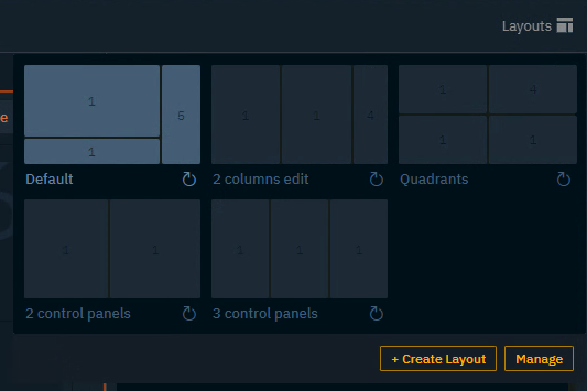
Save new layout
-
Click on "Layouts" to open the Layout browser
-
Click "Create Layout" and give it a name
This saves the current layout and shows a layout thumbnail for it.
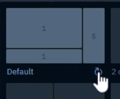
Change layout
-
Click on "Layouts" to open the Layout browser
-
Click on a layout thumbnail
The thumbnail shows a simplified view of the layout. The numbers indicate the amount of tabs present in that section.
Reset layout
Each layout has
-
a saved state
-
this is the state when you had last saved the layout
-
clicking the reset button brings you back to this state
-
-
unsaved state
-
this includes any changes made to the layout without saving
-
clicking the reset button discards this state
-
To discard the unsaved changes and bring you back to the saved state
-
Click the reset button next to the layout’s
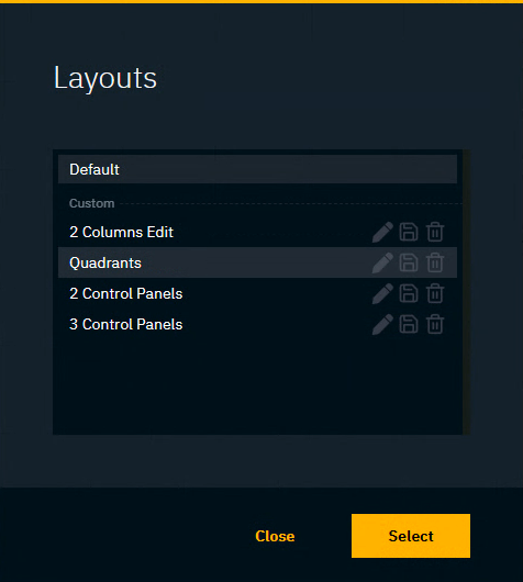
Manage layouts
Here you can
-
Rename the layout by clicking the Edit icon
-
Overwrite the layout with the currently visible layout by clicking the Save icon
-
Delete the layout by clicking the Delete icon
Panels
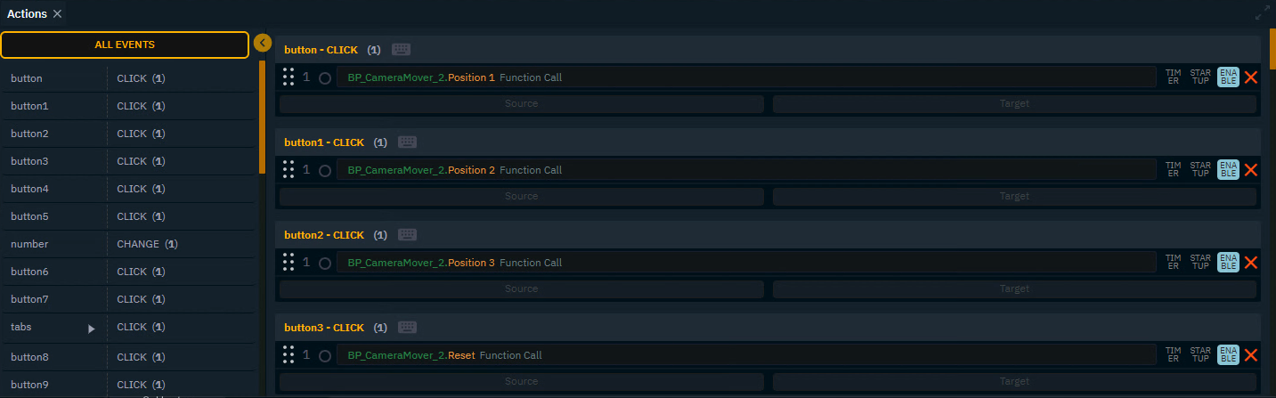
Actions
-
Left side: Shows all possible actions for all widgets on the canvas
-
Selecting one from here (or double clicking the widget on the canvas) will filter the widgets action on the right side
-
-
Right side: Allows you to drag & drop a source and target from the Properties sections
OR double click the source field to edit the value directly
Learn more about how to Edit actions
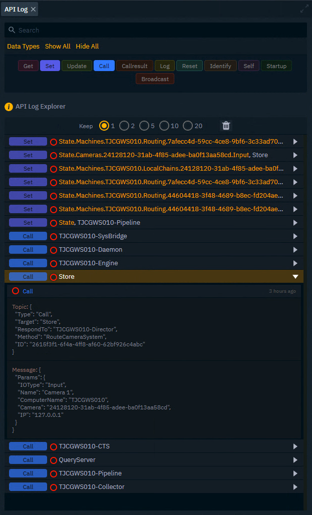
API Log (for advanced users)
Shows all Pixotope API messages
Learn more about how to Replicate any Pixotope functionality - API Log tab
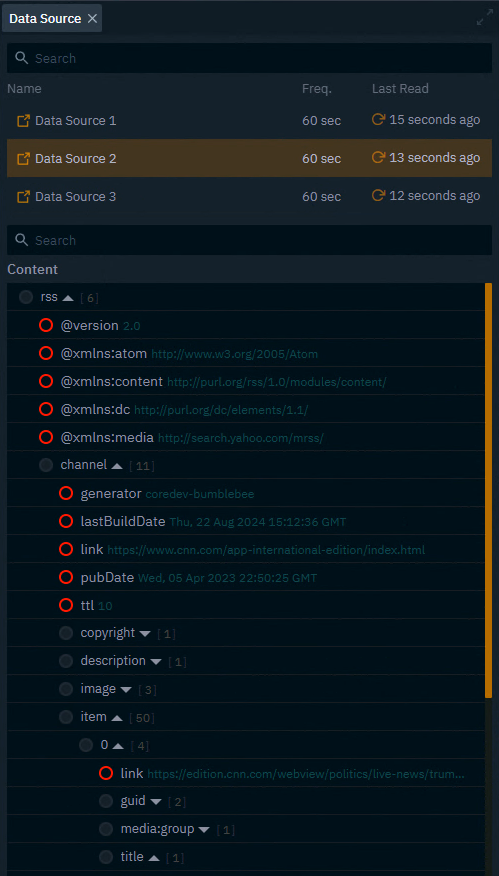
Data source
Browse Data Mapper sources and their content
Learn more about Using Data Mapper
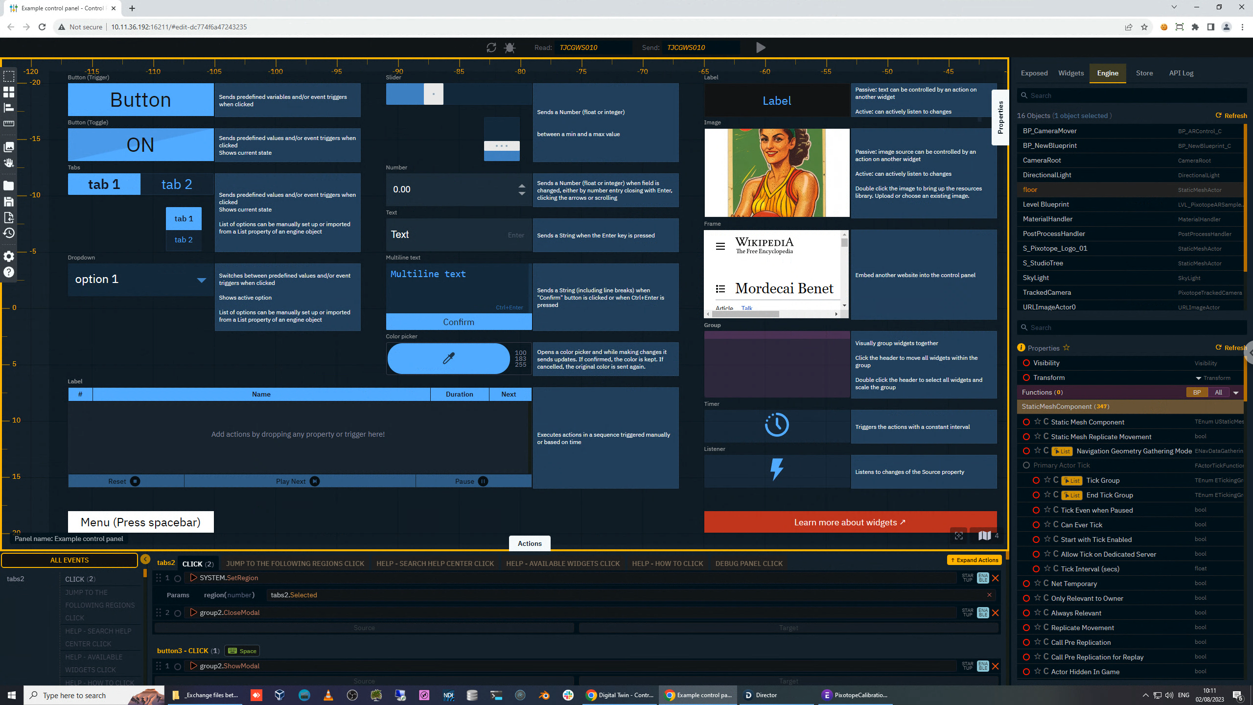
Control Panel - Edit
Only one Control Panel - Edit panel can be added.
Canvas
The working area where widgets are drawn/placed.
Learn more about how to Add widgets and actions and all available widget types
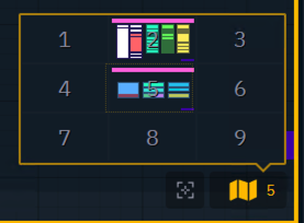
Regions
The canvas is divided into 9 regions. The main region is the one in the center, region 5.
The Map icon on the bottom right of the canvas shows an interactive mini-map, but you can also use shortcuts or System actions to jump between regions.
Learn more about Control panel - Keyboard shortcuts
Read from send to header
Select which engine to read from, and which to send to
Make sure a level is running to gather its engine content and properties
-
Left side: Select one machine to read from
-
Only machines which have a level launched (running engine) are listed
-
-
Right side: Select one or more machines to send to
-
Or use the groups if available
-
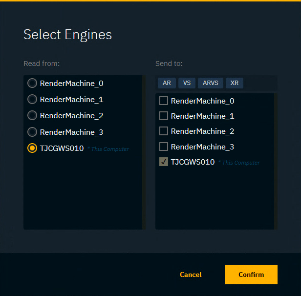
The Read from Send to header is similar to the one in the adjustment panels. Learn more about Adjusting levels - Live changes and Group overrides
Play/Stop
Toggle between Edit and Preview Live mode
Widgets bar
-
Shows the main widgets and allows dragging them onto the canvas
-
The active widget is highlighted
-
-
Shows the system action icon at the bottom
Learn more about Control panel - Widget types
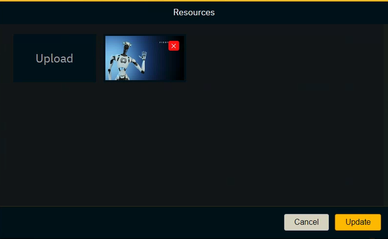
Resources library
Add/Remove image resources
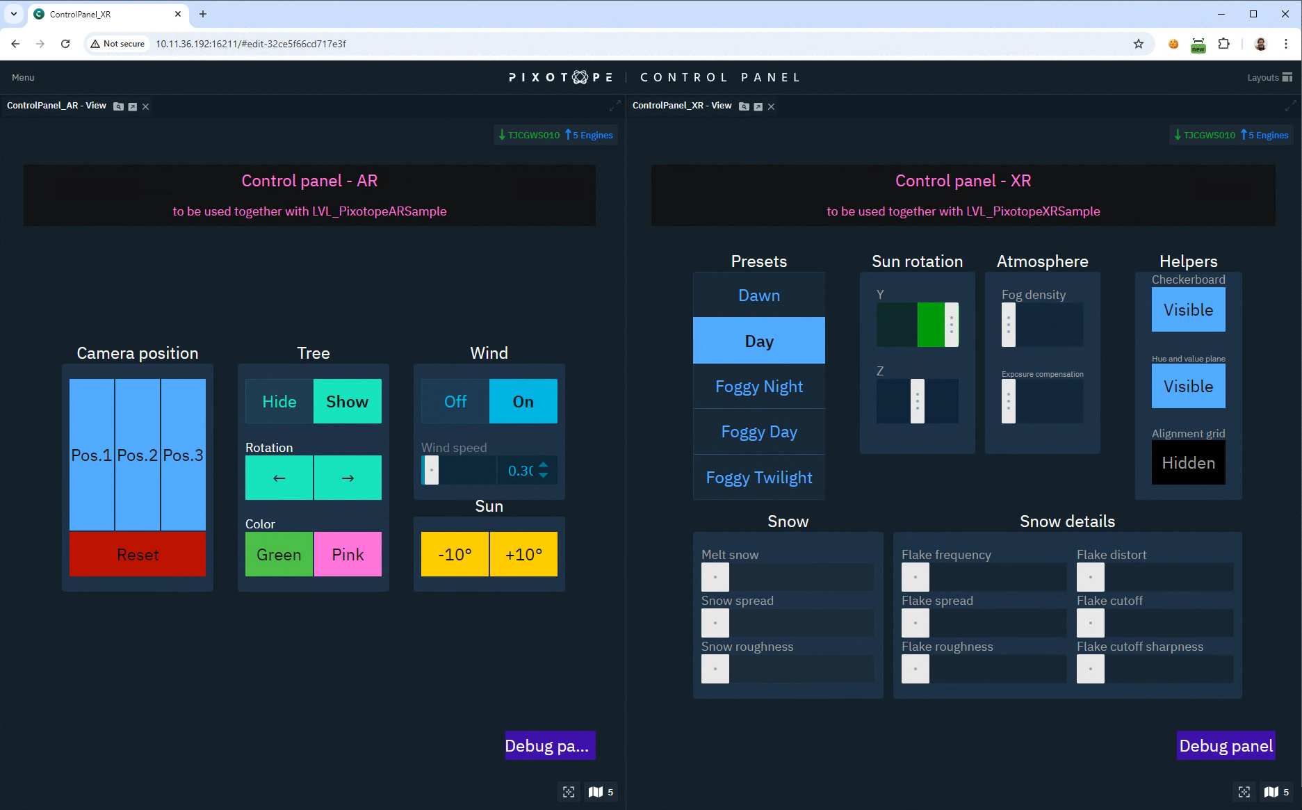
Control Panel - View
-
Shows a control panel in view/play mode
-
Multiple control panels can be used at the same time
Engine Browser
-
Shows all objects/actors in a level
-
Shows all properties of the selected object(s)
Learn more about how to Find the property to control
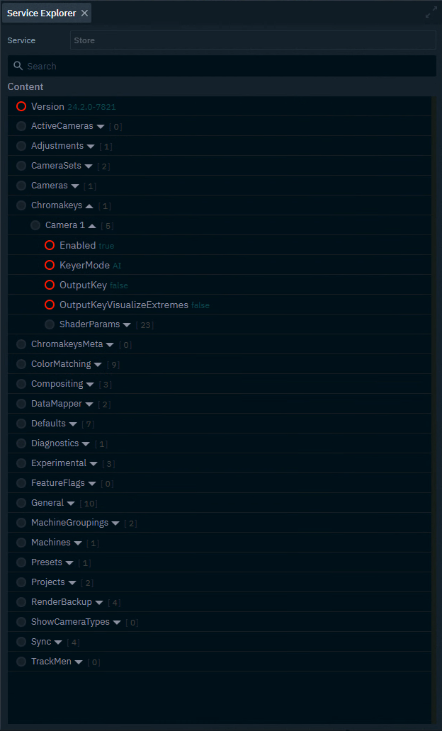
Service Explorer (for advanced users)
Shows all properties of the current show file
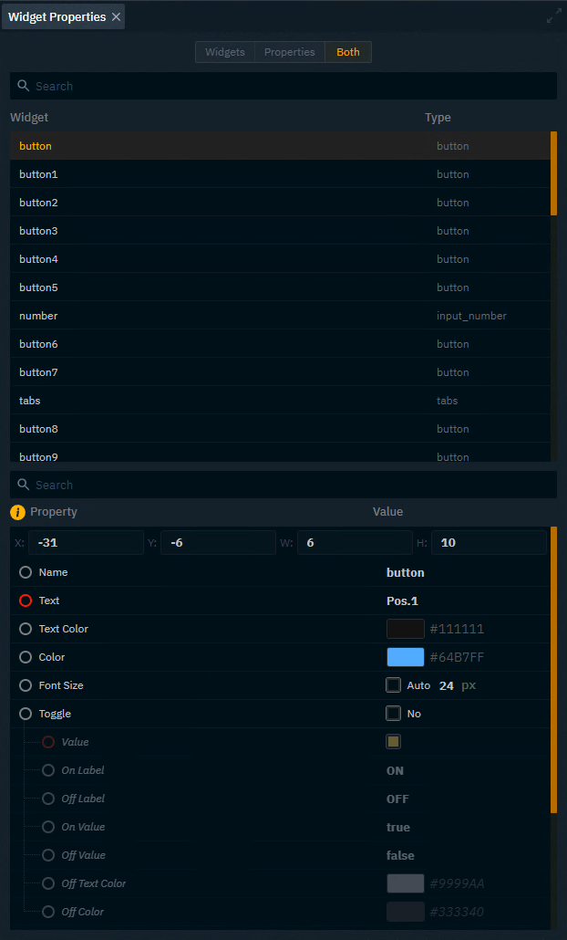
Widgets
-
Shows all widgets placed on your canvas
-
Allows to edit all the properties