General
|
Property |
Description |
Property Type |
|---|---|---|
|
Name |
Name of the widget |
|
|
X |
X-axis position |
|
|
Y |
Y-axis position |
|
|
W |
Width |
|
|
H |
Height |
|
|
Color |
Main color of the widget |
|
|
Show Label |
Toggle for displaying label |
|
|
Label |
Text displayed as widget label |
|
|
Label Size |
Size of label text |
|
|
Label Color |
Color of label text |
|
|
Label Position |
Placement of the label |
|
|
Interactive |
When disabled, the widget can only be viewed and is not interactive |
|
2D Pad
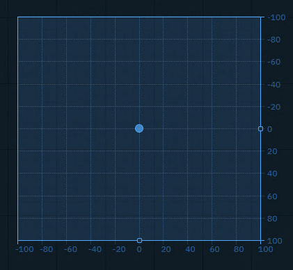
Sends an x and y Number (float or integer) between a min and a max value, allowing to adjust the snap and grid size.
You can use it to
-
control any 2 number values you want to have interactive control over
|
Property |
Description |
Property Type |
|---|---|---|
|
Relative |
Use relative positioning |
|
|
X |
X coordinate |
|
|
Min X |
Minimum X value |
|
|
Max X |
Maximum X value |
|
|
Decimal X |
X decimal places |
|
|
Step X |
X increment step |
|
|
Grid X |
X grid divisions |
|
|
Show Label X |
Show X label |
|
|
Y |
Y coordinate |
|
|
Min Y |
Minimum Y value |
|
|
Max Y |
Maximum Y value |
|
|
Decimal Y |
Y decimal places |
|
|
Step Y |
Y increment step |
|
|
Grid Y |
Y grid divisions |
|
|
Show Label Y |
Show Y label |
|
|
User Action |
Handler Event |
Trigger Event |
Default source |
|---|---|---|---|
|
Click or click and drag |
onChange |
CHANGE |
|
Button (Trigger)
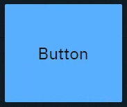
Sends predefined variables and/or event triggers when clicked. You can use it to
-
Trigger Blueprint events
-
Virtual camera moves
-
Actions/States
-
-
Trigger video keyer presets
-
Set
-
Actor transform
-
Actor parameters
-
|
Property |
Description |
Property Type |
|---|---|---|
|
Text |
Button text |
|
|
Text Color |
Color of button text |
|
|
Font Size |
Size of button text |
|
|
Toggle |
Whether button toggles. See Button (Toggle) |
|
|
User Action |
Handler Event |
Trigger Event |
Default source |
|---|---|---|---|
|
Click on button |
CLICK |
CLICK |
- |
Button (Toggle)
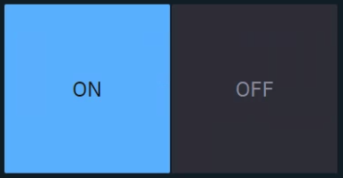
Sends predefined values and/or event triggers when clicked, while showing the current state.
You can use it
-
as a 2-state trigger
-
for on/off actions
-
Light switches
-
A to B transitions
-
Visibility toggles
-
Any boolean
-
|
Property |
Description |
Property Type |
|---|---|---|
|
Same as Button (Trigger), but with Toggle enabled. |
||
|
Value |
Current toggle state |
|
|
On Label |
Text when toggled on |
|
|
Off Label |
Text when toggled off |
|
|
On Value |
Value when toggled on |
|
|
Off Value |
Value when toggled off |
|
|
Off Text Color |
Color when off |
|
|
Off Color |
Background when off |
|
|
User Action |
Handler Event |
Trigger Event |
Default source |
|---|---|---|---|
|
Click on button |
CLICK |
CLICK |
|
|
Click on ON |
ON |
ON |
|
|
Click on OFF |
OFF |
OFF |
|
Button grid
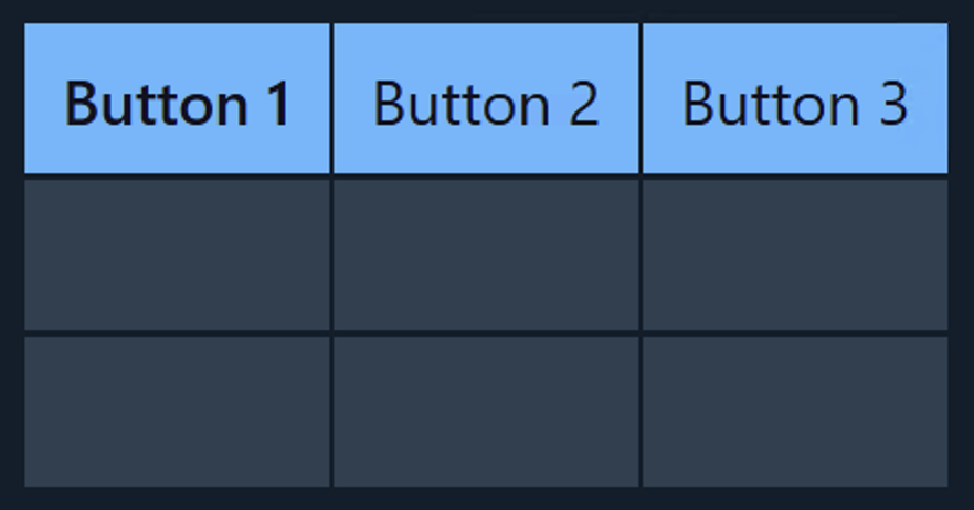
Sends predefined values and/or event triggers when clicked, while showing all options.
The list of options can be manually set up, imported from a List property of an engine object or populated using specific system actions.
Learn more about how to Populate Options for Tab and Dropdown widget
You can use it to
-
switch between predefined values (
Number,String)-
Infographics
-
Name fields
-
Title bars
-
|
Property |
Description |
Property Type |
|---|---|---|
|
Highlight last selected |
Whether to show the last selected |
|
|
Highlight Color |
Set the last selected color |
|
|
Cache Value |
Whether to cache selected value |
|
|
Selected |
The value of the currently selected tab |
|
|
Text value |
The display name of the currently selected tab |
|
|
Options |
Available options |
|
|
Populate |
Populate options using predefined queries |
Action |
|
Font Size |
Text size |
|
|
Columns |
Number of columns |
|
|
Scroll |
Allow scrolling |
|
|
Enable Rows |
Whether to use a fixed set of rows |
|
|
Rows |
Number of rows |
|
|
User Action |
Handler Event |
Trigger Event |
Default source |
|---|---|---|---|
|
Click on button |
CLICK |
CLICK |
|
|
Click on Button 1 |
BUTTON 1 CLICK |
BUTTON 1 CLICK |
|
|
Click on Button 2 |
BUTTON 2 CLICK |
BUTTON 2 CLICK |
|
|
… |
|
|
|
Color picker
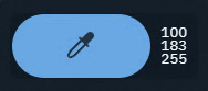
Opens a color picker and while making changes it sends updates
-
if confirmed, the color is kept
-
if cancelled, the original color is sent again
You can use it to
-
control light colors
|
Property |
Description |
Property Type |
|---|---|---|
|
Color |
Selected color |
|
|
Details |
Color format display |
|
|
User Action |
Handler Event |
Trigger Event |
Default source |
|---|---|---|---|
|
Change color
|
CHANGE |
CHANGE |
|
Dropdown
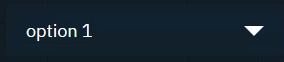
Switches between predefined values and/or event triggers when clicked, while showing the active option.
Use it the same way as the Tab widget.
|
Property |
Description |
Property Type |
|---|---|---|
|
Selected |
Currently selected option |
|
|
Text value |
The display name of the currently selected tab |
|
|
Options |
Available options |
|
|
Populate |
Populate options using predefined queries |
Action |
|
Cache Value |
Whether to cache selected value |
|
|
Text Color |
Text color |
|
|
Font Size |
Text size |
|
|
User Action |
Handler Event |
Trigger Event |
Default source |
|---|---|---|---|
|
Click on an option in the dropdown |
CHANGE |
CHANGE |
|
Frame
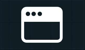
Embed another website into the control panel.
You can use it to
-
load other control panels
-
load help center articles
-
load external graphics
|
Property |
Description |
Property Type |
|---|---|---|
|
URL |
Web page to display |
|
|
Display |
Visibility setting |
|
|
Active |
Whether it is an active listener |
|
Group

Visually group widgets together.
You can use it
-
to organize your control panel
-
as a modal dialog
-
Click the header to move all widgets within the group
-
Double click the header to select all widgets and scale the group
|
Property |
Description |
Property Type |
|---|---|---|
|
Modal |
Shows the group as modal dialog |
|
|
Trigger |
Description |
|
ShowModal |
Opens the modal dialog |
|
CloseModal |
Closes the modal dialog |
Image
-
Passive: image source can be controlled by an action on another widget
-
Active: can actively listen to changes
-
Double click the image to bring up the resources library
-
Upload or choose an existing image
-
Resources are stored in [Project folder]/ControlPanel/[Control panel folder]
Learn more about how to send images to the engine
You can use it to
-
display images
-
from url
-
from local file system
-
-
send image URLs to the URLImageActor
-
organize your control panel
|
Property |
Description |
Property Type |
|---|---|---|
|
URL/Src |
Image source |
|
|
Display |
Visibility setting |
|
|
Stretch |
How image fits frame |
|
|
Active |
Whether it is an active listener |
|
Label
Shows a text or JSON view.
-
Passive: can be controlled by an action on another widget
-
Active: can actively listen to changes
You can use it to
-
have an independent label text with optional background color
-
display values as text or JSON
-
organize your control panel
-
select and copy values
|
Property |
Description |
Property Type |
|---|---|---|
|
Text |
Label text |
|
|
Render |
Rendering method |
|
|
Background |
Background color |
|
|
Selectable |
Whether text is selectable |
|
|
Active |
Whether label is active |
|
|
User Action |
Handler Event |
Trigger Event |
Default source |
|---|---|---|---|
|
- |
LISTENER |
LISTENER |
|
Listener

Listens to changes of the Source property.
You can use it to
-
listen to the change of any property
|
User Action |
Handler Event |
Trigger Event |
Default source |
|---|---|---|---|
|
- |
LISTENER |
LISTENER |
- |
Number
Sends a Number (float or integer)
You can use it to
-
update numeric values
-
Scoreboards
-
Statistics
-
Data
-
-
trigger Blueprint events that take a numeric parameter
|
Property |
Description |
Property Type |
|---|---|---|
|
Min |
Minimum value |
|
|
Max |
Maximum value |
|
|
Value |
Current value |
|
|
Unit |
Unit of measurement |
|
|
Precision |
Decimal places |
|
|
Font Size |
Text size |
|
|
Trigger |
Description |
|
Focus |
Focuses the input field |
|
User Action |
Handler Event |
Trigger Event |
Default source |
|---|---|---|---|
|
CHANGE |
CHANGE |
|
Playlist
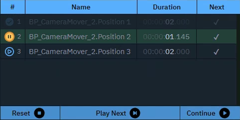
Executes actions in a sequence triggered manually or based on time.
You can use it to
-
control actions in a sequence
|
Property |
Description |
Property Type |
|---|---|---|
|
Play on startup |
Auto-play setting |
|
|
Controls |
Show playback controls |
|
|
Getter |
Description |
|
CurrentActionIndex |
Get current action index |
|
CurrentActionName |
Get name of current action |
|
CurrentActionDuration |
Get duration of current action |
|
CurrentActionProgress |
Get progress of current action |
|
CurrentActionTime |
Get time of current action |
|
NextIndex |
Get next action index |
|
NextName |
Get name of next action |
|
OverallTimeElapsed |
Get total elapsed time |
|
GetCount |
Get total number of actions |
|
Trigger |
Description |
|
NextAction |
Trigger next action |
|
StopAction |
Stop playlist and reset playhead |
|
StartFrom |
Go to |
|
Pause |
Go to |
|
Resume |
Resume playlist |
|
Delay |
Delay next action |
|
Pause |
Pause playlist |
Remote Call
Enables communication with the Pixotope Gateway API, allowing for external triggering of Control Panel actions via HTTP requests.
Learn more about Remote control the control panel
You can use it to
-
trigger control panel widgets/actions from third party applications
|
Property |
Description |
Property Type |
|---|---|---|
|
Methods |
Available options |
|
|
Data |
Whether timer is active |
|
|
User Action |
Handler Event |
Trigger Event |
Default source |
|---|---|---|---|
|
|
METHOD1 |
METHOD1 |
|
|
… |
|
|
|
Slider
Sends a Number (float or integer) between a min and a max value.
You can use it to
-
control virtual lights
-
control physical lights
-
via DMX
-
-
control X/Y/Z dimensions of transforms
-
control color channels
-
control any states you want to fade between
-
control any number value you want to have interactive control over
|
Property |
Description |
Property Type |
|---|---|---|
|
Min |
Minimum value |
|
|
Max |
Maximum value |
|
|
Value |
Current value |
|
|
Step |
Step increment |
|
|
Decimal |
Decimal places |
|
|
Middle |
Show middle marker |
|
|
Orientation |
Slider direction |
|
|
User Action |
Handler Event |
Trigger Event |
Default source |
|---|---|---|---|
|
Click or click and drag |
onChange |
CHANGE |
|
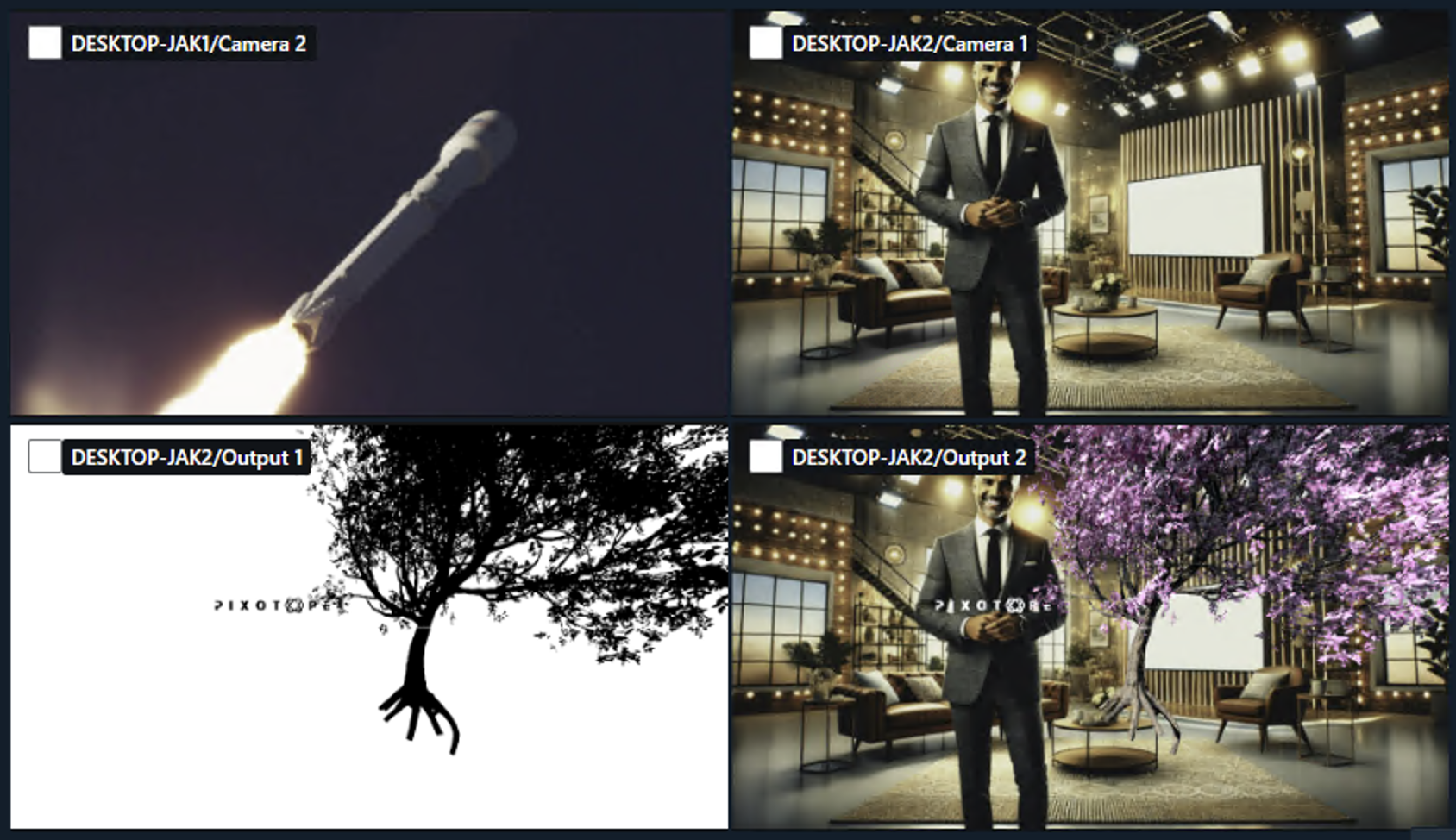
Snapshot
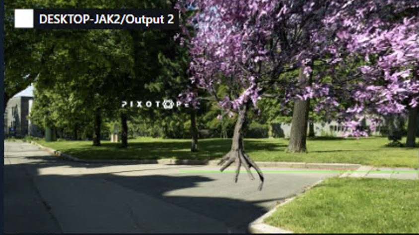
Captures an image from a selected node of the videoIO pipeline from a specific machine.
Capturing images from the VideoIO service has a performance impact.
-
The smaller the requested image scale the less impact it has on VideoIO
-
The larger the interval the less impact it has on the network load
Test this thoroughly before using it in production!
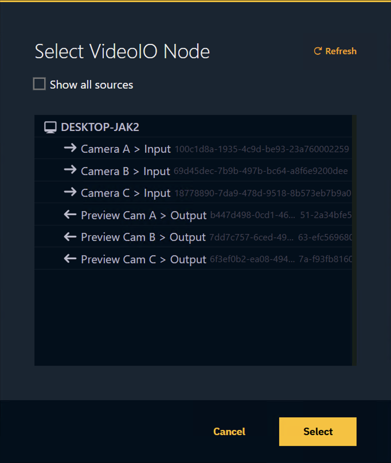
Setup
-
Right click the widget and click on the
…of the Node property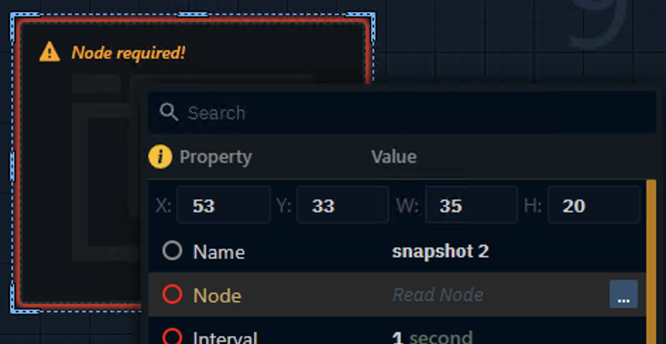
-
In the VideoIO Node selection select the inputs or outputs you want to capture
-
Optionally click "Show all sources" for all intermediary states
-
-
Set the scale and update interval
Can be used to
-
build a multi-viewer
|
Property |
Description |
Property Type |
|---|---|---|
|
Auto Start |
Starts the interval immediately |
|
|
Node |
Select which videoIO node the image should be captured from |
|
|
Interval |
Capture frequency |
|
|
Scale |
Image scale |
|
|
Requests Sent |
Count of sent requests |
|
|
Frames Received |
Count of received frames |
|
|
Process Time |
Time to generate the frame |
|
|
Image |
Output |
|
|
Display |
Visibility setting |
|
|
Stretch |
How image fits frame |
|
|
Trigger |
Description |
|
Resume |
Starts the interval |
|
Stop |
Stops the interval |
|
Fetch |
Fetches image data once |
|
Download |
Downloads the latest image data |
|
User Action |
Handler Event |
Trigger Event |
Default source |
|---|---|---|---|
|
- |
RECEIVED |
RECEIVED |
- |
Tabs
Sends predefined values and/or event triggers when clicked, while showing all options.
The list of options can be manually set up, imported from a List property of an engine object or populated using specific system actions.
Learn more about how to Populate Options for Tab and Dropdown widget
You can use it to
-
switch between predefined values (
Number,String)-
Infographics
-
Name fields
-
Title bars
-
|
Property |
Description |
Property Type |
|---|---|---|
|
Cache Value |
Whether to cache selected value |
|
|
Selected |
The value of the currently selected tab |
|
|
Text value |
The display name of the currently selected tab |
|
|
Options |
Available options |
|
|
Populate |
Populate options using predefined queries |
Action |
|
Scroll |
Allow scrolling |
|
|
Font Size |
Text size |
|
|
Orientation |
Tab orientation |
|
|
User Action |
Handler Event |
Trigger Event |
Default source |
|---|---|---|---|
|
Click on tab |
CLICK |
CLICK |
|
|
Click on Tab 1 |
TAB 1 CLICK |
TAB 1 CLICK |
|
|
Click on Tab 2 |
TAB 2 CLICK |
TAB 2 CLICK |
|
|
… |
|
|
|
Text
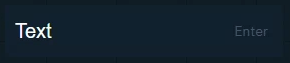
Sends a String. The text can be typed or pasted in.
You can use it to
-
update text and number values
-
News tickers
-
Infographics
-
Name fields
-
Title bars
-
Scoreboards
-
-
trigger Blueprint events that take a text OR numeric parameter
|
Property |
Description |
Property Type |
|---|---|---|
|
Text |
Input text |
|
|
Trigger |
Description |
|
Enter |
Submits/Sends the string |
|
Focus |
Focuses the input field |
|
User Action |
Handler Event |
Trigger Event |
Default source |
|---|---|---|---|
|
Press |
CHANGE |
CHANGE |
|
Text (multiline)
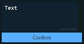
Sends a String (including line breaks).
Text can be typed or pasted.
Use it the same way as the Text widget.
|
Property |
Description |
Property Type |
|---|---|---|
|
Text |
Content of text area |
|
|
Confirm |
Text of confirmation button |
|
|
Button Color |
Button background color |
|
|
Trigger |
Description |
|
Focus |
Focuses the input field |
|
User Action |
Handler Event |
Trigger Event |
Default source |
|---|---|---|---|
|
Press |
CHANGE |
CHANGE |
|
Timer
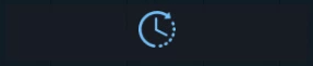
Triggers the actions with a constant interval.
You can use it to
-
set up triggers with a constant interval
|
Property |
Description |
Property Type |
|---|---|---|
|
Interval |
Time between triggers |
|
|
Auto Start |
Start interval when going live |
|
|
Enabled |
Whether timer is active |
|
|
Trigger |
Description |
|
Start |
Starts the timer |
|
Stop |
Stops the timer |
|
User Action |
Handler Event |
Trigger Event |
Default source |
|---|---|---|---|
|
- |
INTERVAL |
INTERVAL |
- |
Vector input (1D, 2D, 3D, 4D)
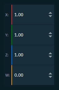
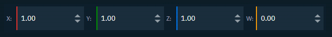
Sends a Vector (1D, 2D, 3D, 4D)
You can use it to
-
update vector values
-
Location
-
Rotation
-
Scale
-
Color
-
|
Property |
Description |
Property Type |
|---|---|---|
|
Axis Labels |
Show axis labels |
|
|
Min |
Minimum value |
|
|
Max |
Maximum value |
|
|
Value |
Vector value |
|
|
Use X |
Toggle X axis |
|
|
Label X |
X axis label |
|
|
Value X |
X axis value |
|
|
Use Y |
Toggle Y axis |
|
|
Label Y |
Y axis label |
|
|
Value Y |
Y axis value |
|
|
Use Z |
Toggle Z axis |
|
|
Label Z |
Z axis label |
|
|
Value Z |
Z axis value |
|
|
Use W |
Toggle W axis |
|
|
Label W |
W axis label |
|
|
Value W |
W axis value |
|
|
Precision |
Decimal places |
|
|
Font Size |
Text size |
|
|
User Action |
Handler Event |
Trigger Event |
Default source |
|---|---|---|---|
|
CHANGE |
CHANGE |
|
System actions
Learn more about System actions