
The Form builder allows you to create a custom layout for the form of a template.
Setup
-
Click "Create custom form" in the Form preview panel
-
A custom form is created based on the auto-form
-
Each input widget is already linked to its target property
-
Form builder is entered in Edit mode
-
The visibility and order of the properties set in the Template properties panel are now ignored.
Edit form layout
-
If you are not already in Edit mode, click the "Edit" button in the top left corner
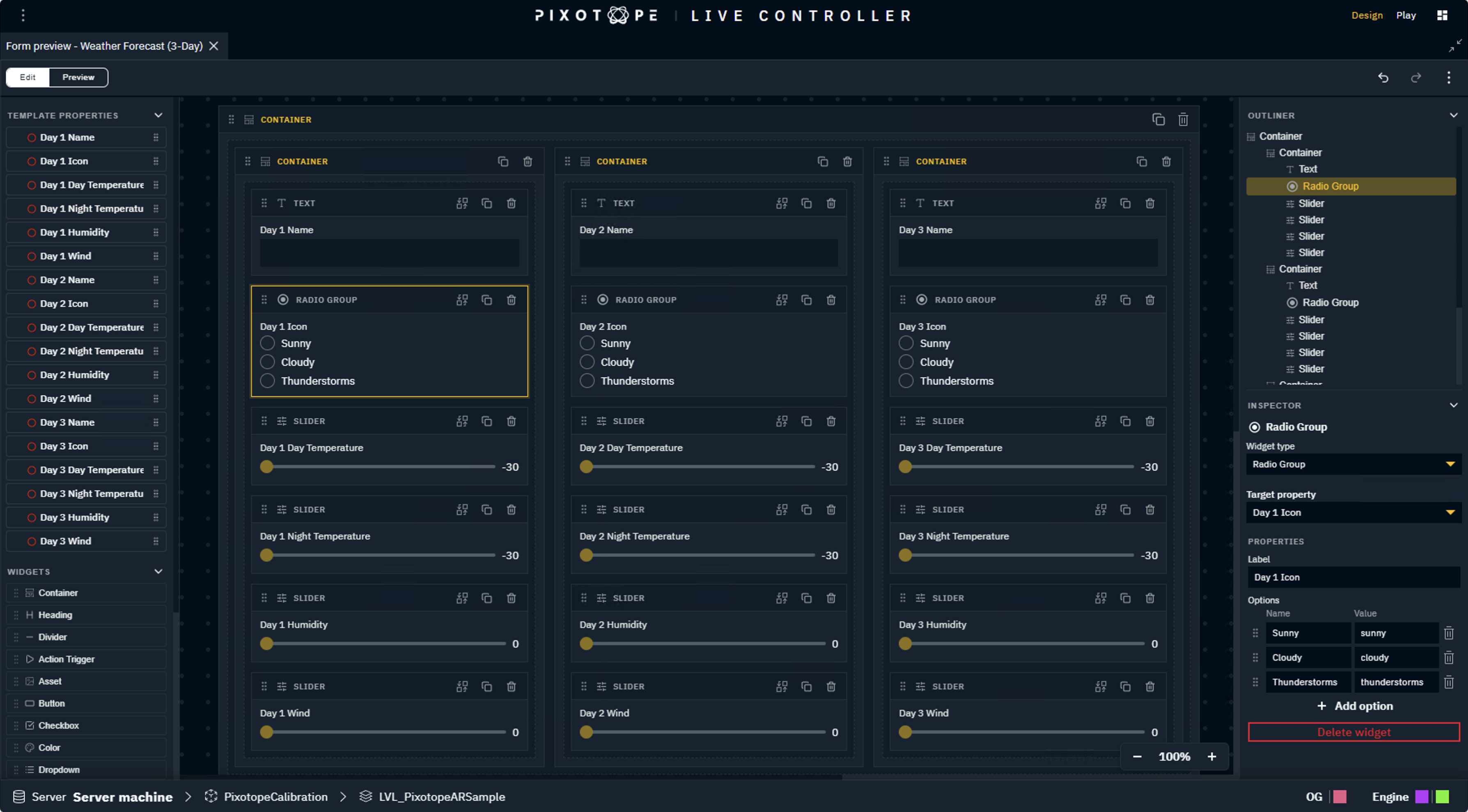
The Edit mode shows
-
on the left side the following draggable options
-
a list of available target properties
-
a list of available widgets
-
-
on the right side
-
an Outliner - gives an overview of the current form and lets you select widgets
-
an Inspector - shows the settings of the selected widgets and allows changing them
-
Click the Expand panel icon on the top right to increase the canvas.
If the panel is too narrow, the left side menu is collapsed and the right side menu is hidden. Use the Cog icon to open the Inspector for that widget as an overlay.
Form width behavior
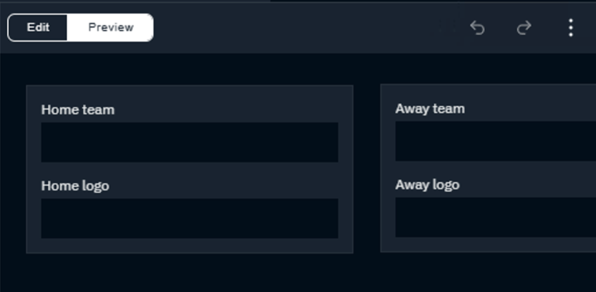
How the form behaves in the panel depends on how you structure the root level of your layout.
|
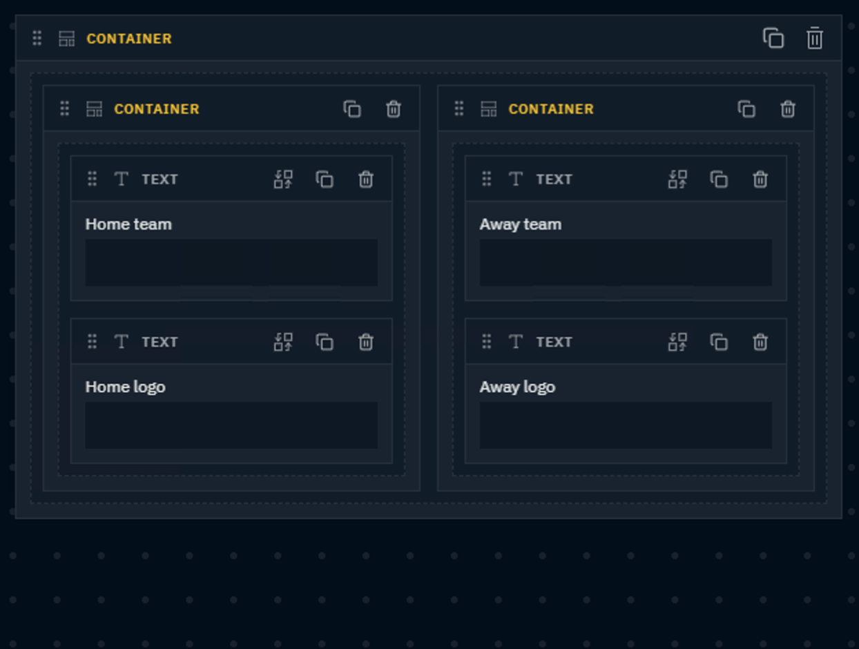
Single Container on root level |
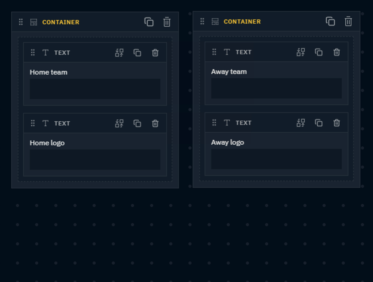
More than one widget on root level |
|---|---|
|
|
|
Form is responsive
|
Form is NOT responsive
|
|
|
To make a form that adapts to the panel it is displayed in, keep a single Container at the root level and build the rest of your layout inside it.
Move a widget
-
Click and drag the header of the widget to move it to a different position
Add a new widget
-
Drag a widget
-
from the left side menu
-
OR directly from the Template properties panel
-
-
Drop it onto a container or the canvas
-
Use the drop indicator to specify where to insert it
-
The target property gets linked right away, if dragging a template property (either from the Template properties panel or from the top part of the left side menu).
Link a target property
If the input widget is not yet linked, or the target has to be updated
-
Select the widget to set/change the target for
-
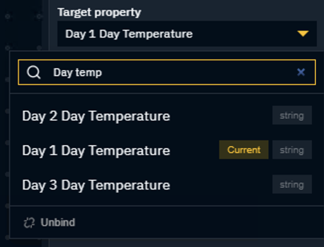
Change the target property using the dropdown in the Inspector
You can use the search input to filter the list.
Swap a widget
-
Click the Swap icon on the widget
OR click the Widget type dropdown in the Inspector -
Select a widget type from the list
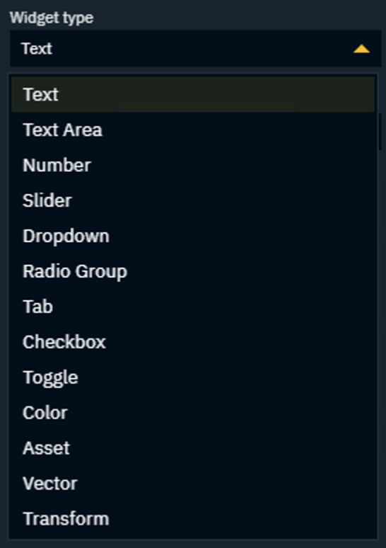
Currently there is no limit to what widget to select. A number type for example can be shown as a number input field or a slider. However, not all widget/target combinations make sense.
Delete or duplicate a widget
-
Click the Delete or Duplicate icon on the widget
Edit form widget properties
-
Select a widget on the canvas or in the Outliner
-
Edit the properties in the Inspector panel
Edit multiple widgets simultaneously
-
On the Canvas or the Outliner
Ctrl + Click(orShift + Clicka range - Outliner only) the widgets you want to edit-
The Inspector shows the properties common to the selected widgets
-
Preview form
-
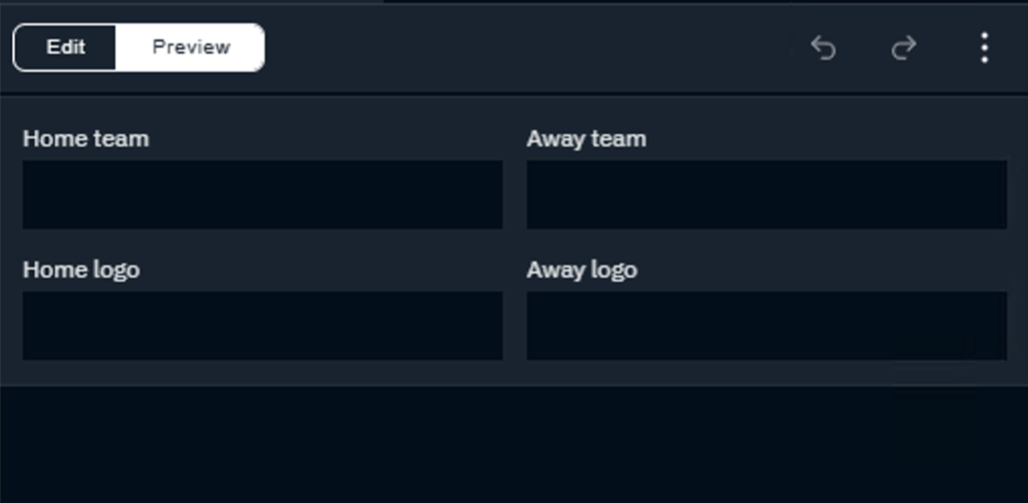
Click Preview in the top left corner of the Form preview panel
This shows the form as an operator will see it. Click Edit to return to editing.
Depending on if you have a single Container widget as a parent on the canvas, the form will span the width and height of the Form panel.
Learn more about Form width behavior above.
Revert to auto-form
-
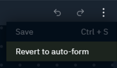
Click the Overflow icon on the top right of the Form preview panel
-
Select Revert to auto-form
The custom layout will be lost!
The visibility and order of the properties set in the Template properties panel applies again.
Available widgets
Layout widgets
Container
Groups widgets and controls their layout. Nest them to build more complex layouts.
Widgets are arranged "flexbox-like” in columns. Default column count is set to 1, which arranges the widgets vertically. The height of the Container depends on Form width behaviour (see above).
Create a 2 column layout:
-
Select the container
-
Set Columns to 2 in the Inspector
Span a container over multiple columns
-
Select the container
-
Set Spans, for example to 2, in the Inspector
|
Bottom container spans 1 column |
Bottom container spans 2 columns |
|---|---|
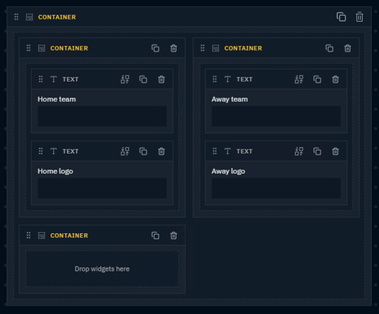
|
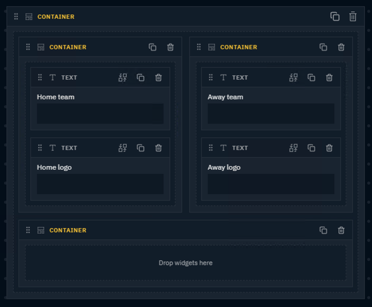
|
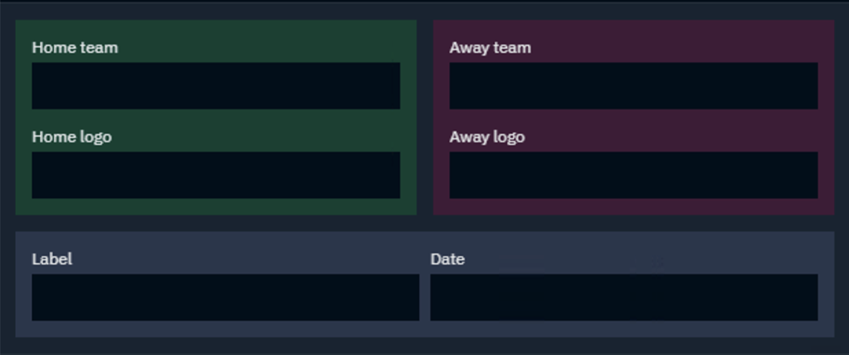
Use Gap, Padding and Background color for styling.
Heading
Adds a heading to label a section of the form
Divider
Adds a horizontal line between sections
Input widgets
These widgets are bound to a template property and are used to control the graphic:
|
Widget |
Options |
|---|---|
|
Action Trigger |
Label, optionally any function parameters using their default widgets |
|
Asset |
Label |
|
Button |
Label, Color, Variant (Primary/Outlined/Ghost/Text), Action payload (JSON) |
|
Checkbox |
Label |
|
Color |
Label |
|
Dropdown |
Label, Options (list editor) |
|
Number |
Label, Placeholder, Precision (0–10) |
|
Radio Group |
Label, Options |
|
Slider |
Label, Min (default 0), Max (default 100), Step (default 1) |
|
Tab |
Label, Options, Orientation (Horizontal / Vertical) |
|
Text |
Label, Placeholder |
|
Text Area |
Label, Placeholder, Rows (1–12, default 3) |
|
Toggle |
Label |
|
Transform |
Label |
|
Vector |
Label, Axis (string array, default X/Y/Z) |