Edit widgets
-
Right click one or more widgets
-
OR select them on the canvas or the Widgets panel
-
-
Change any of the properties in the properties section by clicking into its value field
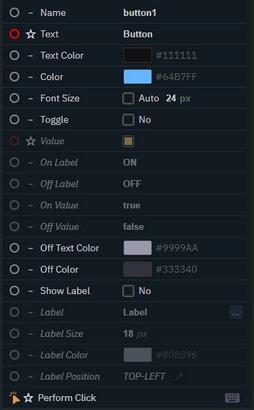
When widgets of different types are selected, only properties they have in common are shown.
Common properties
|
Name |
Name (unique) |
|---|---|
|
Color |
Main color |
|
Label |
Show an internal label, style and position it |
|
Size and position |
X, Y, width and height |
Populate Options for Tab and Dropdown widget
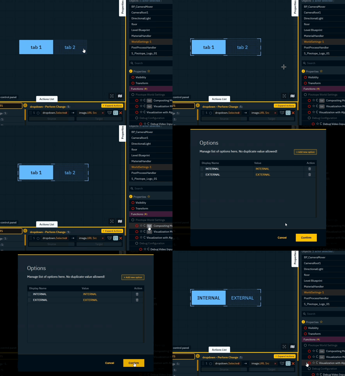
Custom options
-
Select the Tab or Select widget
-
Double click the
Listicon of anEnumorArraylike property in the Engine panel -
Remove or reorder options if needed
-
Click "Confirm"
Predefined options
Or use one of the predefined options
-
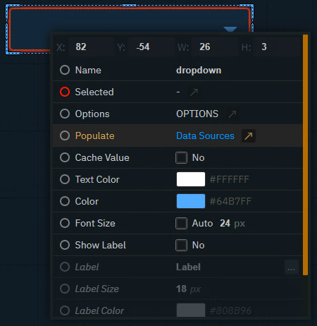
Right click the Tab or Dropdown widget
-
Click on Populate > Custom
-
Choose an option and click "Confirm"
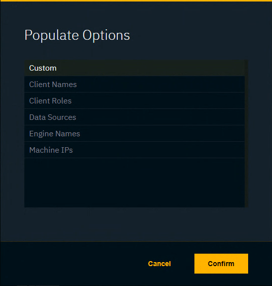
List of predefined options
|
|
Display name |
Value |
|---|---|---|
|
Client Names |
|
|
|
Client Roles |
|
|
|
Data Sources |
Data source name |
Data source ID |
|
Engine Names |
Machine name |
Machine name |
|
Machine IPs |
Machine name |
IP Address |
Learn more about Using the Pixotope API and the Pixotope API - Message Schema
Layout widgets
Widgets placed on the control panel are laid out on a responsive grid. A widget which is covering half the width of the control panel, will do so regardless of how wide your browser screen is.
Use font size Auto to automatically adjust the font size based on the actual widget size.


Organize widgets
To organize your widgets in the control panel you have different options.
Use regions
If you run out of space, you can switch from the center region (5) to one of the 8 surrounding regions in the control panel.
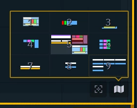
Switch between regions
-
Open the Minimap on the bottom right corner of the canvas and click on a region
-
Use the number keys
1-9 -
Use
Cto switch to the center region (5) -
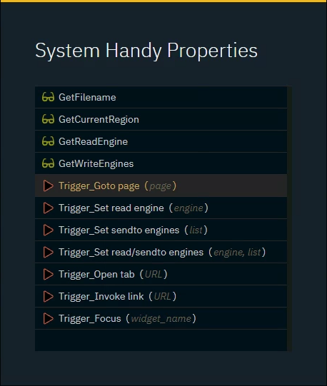
Use the Trigger_Goto region action from the System actions menu
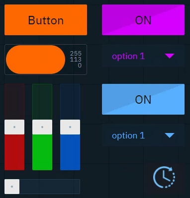
Use color
Every widget has a main color allowing to create visual relationships
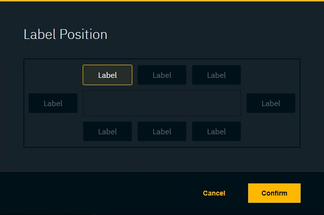
Use internal labels
Every widget has an internal label allowing you to add descriptions.

Right click the widget to toggle, style and position it.
Use groups
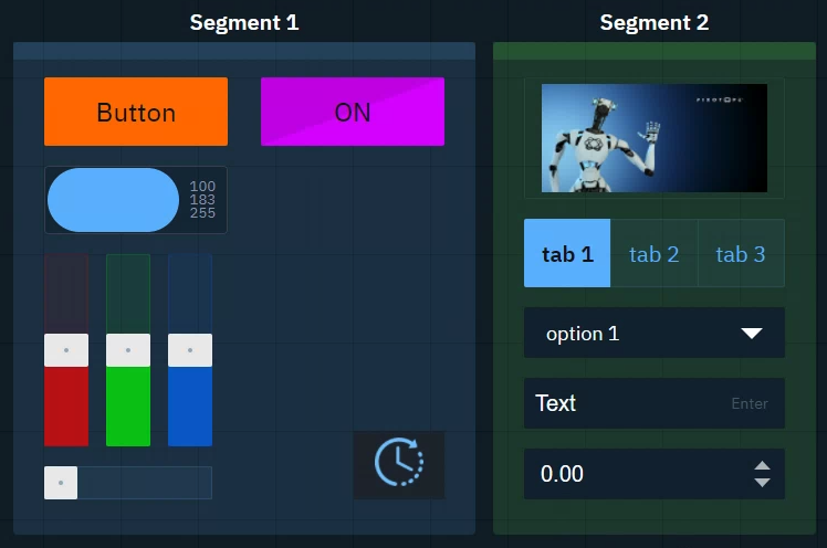
Group background widgets allow to group widgets together
Double click the header of the group widget to select and move all widgets within the group
Use modal dialogs
Any group can be turned into a modal dialog which can be triggered from any region.
-
Enable Modal in the Group widget properties
-
Link the Show modal action to a widget
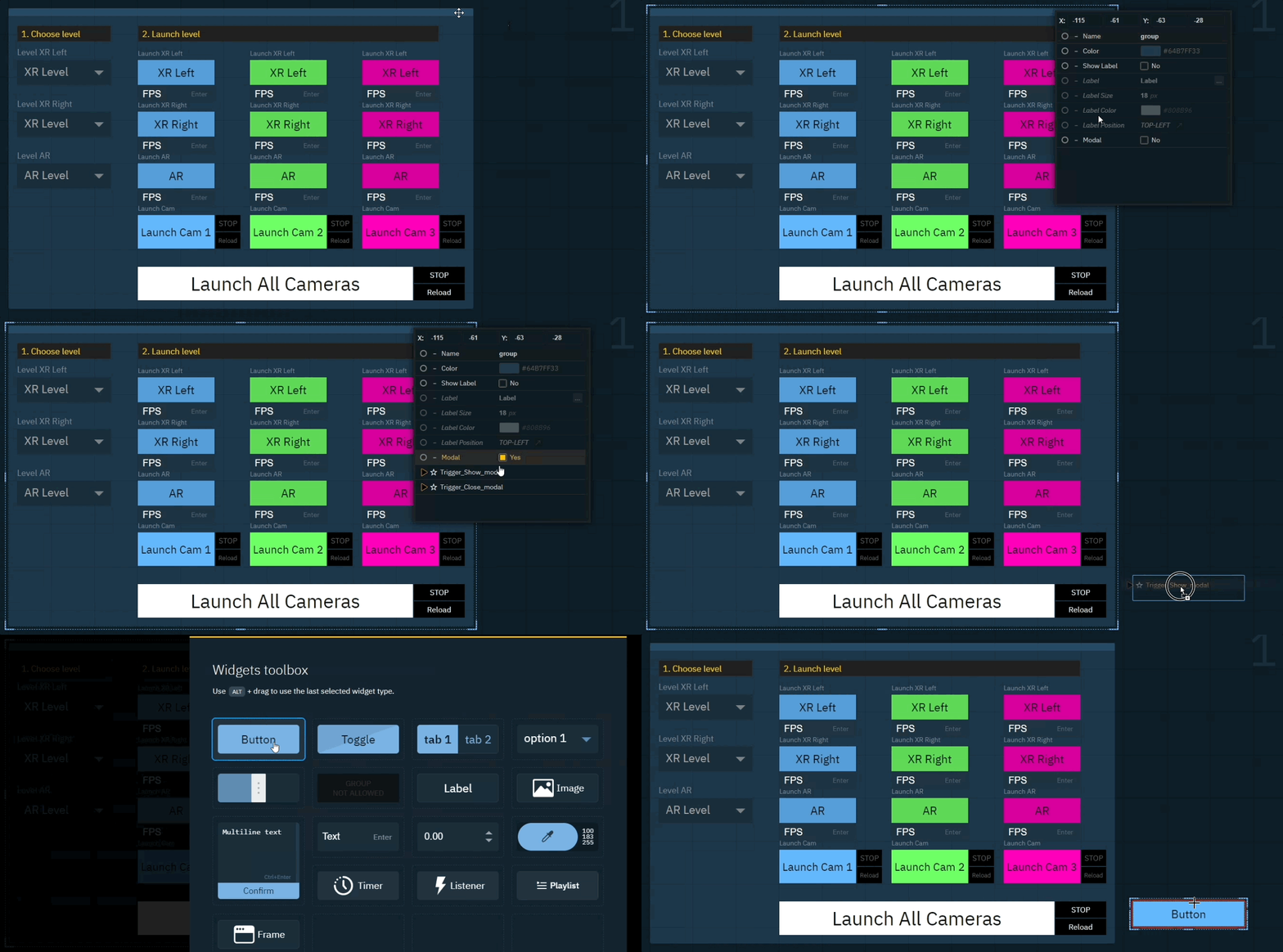
-
Place the widget where ever needed
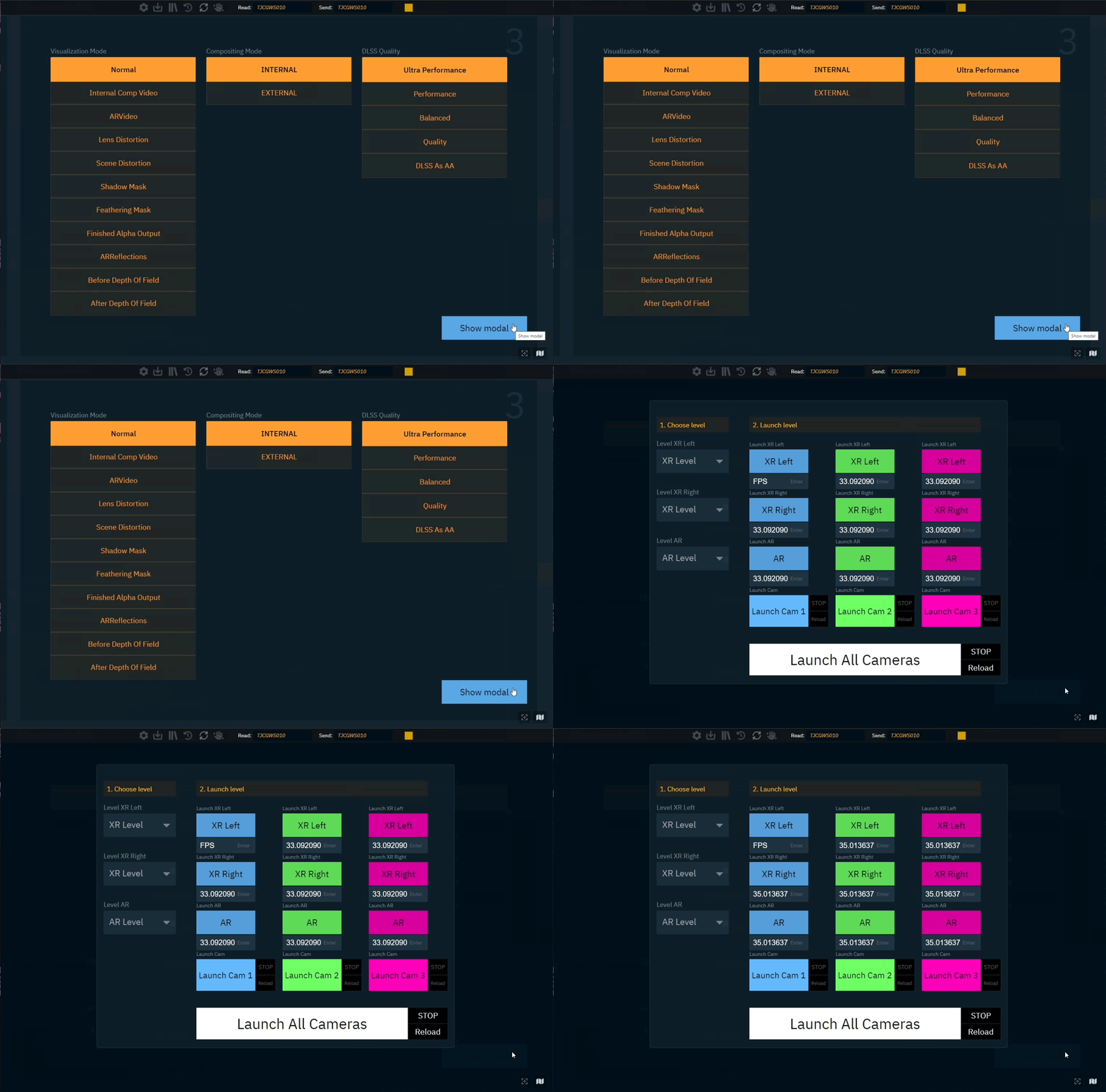
Showing the modal dialog can also be linked to a hotkey. Learn more about how to use hotkeys
Use label widgets
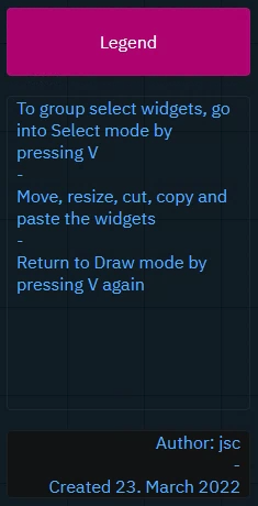
Label widgets allow to add longer descriptions with more formatting options.
Select widgets
Select a single widget
-
Click the widget on the canvas
OR
-
Select the widget name in the Widgets panel
Select multiple widgets
-
Drag a selection rectangle over the widgets in the canvas
If the mode is set to Insert, it automatically switches to Select when the insert rectangle intersects with another widget. To manually switch to Select, click on the icon in the toolbar or press V.
Copy/Duplicate widgets
Duplicate one or more widgets
-
Select the widgets to copy
-
Press
Ctrl+CandCtrl+V(orCtrl+D)-
the widgets are inserted at the location of the mouse or the next available space
-
NOTE: this also works across different control panels!
-
OR
-
Select the widgets to copy
-
Press the
Altkey and start dragging the selection
Actions are copied together with the widget. If a copied action refers to a widget included in the selection, the action is updated to refer to the new widget.
For copying actions only, check out Copy an action
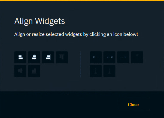
Align widgets
-
Select the widgets to align
-
Press
Aor click the align icon on the bottom right
Depending on the selection you get the option to
-
Align left, right and center
-
Align top, bottom and center
-
Extend to the left, right or on both ends
-
Extend to the top, bottom or on both ends
Snap to grid
There are cases where a widget can end up not being aligned to the grid.
-
Press
Sto snap all widgets to the grid
